Quantcast
Channel: Price Action Trading Strategy – ParaCurve
Viewing all 35 articles
Browse latest View live

The 101 Guide to Inner Trendlines

$
0
0

We have discussed inner trendlines over and over again on this site, and it became obvious to me that the idea is only loosely seeded at best. And so today we are taking a step back, explaining the relevance, importance, and best practices for drawing these very precise turning points on your charts.

Many people view what I do with trendlines as either haphazard or done with the benefit of hindsight. One of the reasons I set up the new board was so that I could actively post more charts demonstrating these types of things before they occur.

The bulk of my trading activity is based on simple trendline breaks and fades. The purpose of this post is to simply clear up common, go-to methods to wipe away ambiguity.

Rookies and the World of Ambiguity

Rookie traders miss a lot of important detail on their charts, and much of this could attributed to the wide range of strategies available to them which directs ambiguous or otherwise vague trading decisions. One of the reasons this website took off in the first place was due to our ability to find precise turning points via horizontal support and resistance.

The methods used to find these levels are really no different for diagonal trendlines, with a few exceptions. The primary difference with diagonal trendlines is that more opportunity presents itself as their ability to act as price turning points is very common.

I always tell people to “look inside the range”. Price rarely bounces off of external points. It typically enters a previous price range prior to reversal or continuation.

Into the base EURUSD

To find those points precisely, we use the following:

What’s In An Inner Trendline?

Inner trendlines are simply trendlines that are drawn “inside” price, not simply higher highs or lower lows (as in “TD points” or “fractals”). Statistically, they are much better performers, and below I will explain why. When we learn how to trade, we are taught that “fractals” are the way to go in terms of drawing support and resistance, whether horizontal or diagonal. This is the conventional thought, taught by thousands and adapted by millions. This assumption, however, is a very dangerous one, as it tends to blur the already vague in terms of reactionary levels.

We tend to end up using inner trendlines for one sole purpose: cleaner and earlier entry on a reversal or continuation. Because they are drawn on the inside of price, it of course takes less time for price to get to it, cutting down on missed opportunity. They also provide us with better direction in terms of clean retests.

Simple Inner Trendline

Simply stated, it does not matter whether your support and resistance level is drawn inside price (inner trendline) or on the periphery (outer trendline). But one things does:

Confluence – The Root of All of Your Decision Making

Confluence is at the heart of everything we do. It is a word that gets used a lot but rarely in the proper context. Confluence refers to a multitude of factors lining up at once, creating a situation of harmony and providing us with guide for future decision making.

When we talk about confluence in regards to finding support and resistance levels, we are seeking hit, after hit, after hit, after hit, on a specific level or price range/trend. Simple.

Confluence is the mother of all support and resistance trading as far as I am concerned. The method for drawing any line on a chart should really boil down to a confluence of factors, whether they be measured moves, or horizontal or diagonal support and resistance.

Look for the hits. I cannot count the number of times I have stated this on this website now. One of the more common FAQ’s I get is “How do I find the best support and resistance levels?”. CONFLUENCE. It really is everything. It is not hard to identify, and most people could adapt themselves to it in a very short amount of time.

Very Important: Work Backwards

Always start from the here and now, and work backwards. I can’t stress this enough. Not only are you going to save yourself heaps of time, but you will also be finding what is the most relevant at any particular moment.

The points closes to price are always the most relevant. People that tend to start from the left of their screen and work forward tend to miss a lot of important detail. Essentially you find yourself always waiting for something that might or might not occur, instead of focusing in on what is.

Working backwards has tons of advantages, regardless of the strategy being used. Again, it primarily boils down to focus on current happenings. Having your macro scale / important levels set up is of course important, but to clearly define entry you want to have local pressure working well in your favor.

Voids and Targets

Voids are “empty” price areas in which no major support and resistance levels are present. When I think in terms of targets, I am also thinking in terms of voids. Voids are where the money is made. Trendline breaks allow us to trade the voids. As an example, here is a recent chart on GBP/USD that was just posted to our board and cleaned up for the purpose of this post. The voids, in this case, are the areas between the key extension levels. Trading through them is where you find your pay.

Entry can be taken after a restest using either local trendlines or simply individual bar or 123 type patterns.

GBPUSD Voids and Targets

Find The Hits

This is relatively straightforward. Most charting software has a “Ray” drawing tool. It allows you to anchor one point, while you find others. Use it instead of your typical trendline tool. Once again, it will save you aggravation and time.

Anchor the mid point of the ray to a local point which clearly will line up with past history. This is the last time this line was hit. Take the other end and slowly drag it up and down your chart so that you able to identify which line simply matters most. These lines that “matter most”, again, refers to confluence.

Avoid the “wicks” of your candles or peaks on your bars. You want to get as close to the root as possible. Find what matters most.

Anchor points

And I Know This Is Messy, So Here Is How You Clear Things Up:

The charts above are messy, to say say the least, to most people. I draw these lines to exemplify the sheer number of times they get used. Clearly, as in the example above, you can’t simply fade or play a breakout on each one without experience some serious hits along the way: it is impractical.

Inner trendlines are of course best used in a contextual sense, and in times of higher liquidity. I use them most when I asses entry upon the completion of a trading range. In other words, a trading range has completed a full, standard cycle (3 hits in opposing directions) and I am seeking the next thrust / breakout.

I typically wait for them to register a retest. When the retest is complete, so is my entry. Again, individual bar patterns or 123 type patterns as well. There is a weighted scale that gets used here, and inner trendlines are used more in the sense of entry on a preexisting idea than anything else. Targets come first.

Additionally, I only trade my macro idea. This is important, and when overtrading tends to kick in for most people. Drawn in by the number of trendlines and other factors, some people are inclined to trade “micro” movements.

In other words, they will say something to the effect of “well I know price is going here eventually, but it is going to go here first, and I can make money doing that, too.” What results are usually unnecessary losses. This is picking or scalping, something which really shouldn’t be done by most discretionary traders. The larger movements are what always moves the equity curve upward.

For Measured Moves on Trendline Breaks: Find the Retest, and Use It!

90% of the questions I get in regards to our measured moves on trendline breaks can be answered with one phrase: find the retest. I didn’t stress this enough in our original article on the topic. This is exemplified in the GBP/USD chart above. While slightly related to what we are discussing here, I wanted to state this yet again in order to highlight its importance.

Using a trendline with a lst leg retest ensures you are on the same page as the rest of the worls. You can go back, find your confluence, and work forward.

Closing Points

To recap, we want to do the following:

1. Work backwards on your chart (right to left) – local points always hold the most relevance and remove unnecessary noise by eliminating the option of support and resistance levels that have no use in the here and now.

2. Find an anchor point – this is typically the last high or low in which price was hit along your trendline

3. Find the confluence – use the line that lines up with the most historical hits

4. Trade through the void and target the major levels – your major levels can be derived in any number of ways. We recommend measured moves and horizontal support and resistance holding key confluence.

Conjunction with other methods is the key here. We want to ensure that we’re looking at this contextually so not to be thrown off by a slew of complication. Seek your targets, and use inner trendlines as a means to get there.

5/5 (4)

NBT is free and has been since 2008. Help us out and rate our content!

The post The 101 Guide to Inner Trendlines appeared first on No Brainer Trades.


To Fade or Not to Fade: Horizontal Support and Resistance

$
0
0

Office was quiet as a mouse today so carpe diem: made a video, answering a question that I have been getting from my early days of writing this blog. Key points:

  • Confluence rules above all. Confluence in identifying the level and especially, confluence in execution.
  • Wait for a natural movement in price. We want to see price completing a reasonable cycle prior to exiting a position or putting on new exposure.
  • Use the inside of the range, not ultimate highs or lows as taught by conventional wisdom.
  • Identification is relatively simple. Just seek multiple hits over and over again.
  • These levels are simply transition points for order flow and rarely go away over time.
  • The more the line is used the more it’s “fade” value deteriorates.

Topics used: Basic support and resistance, measured moves on trendline breaks, triple taps / 5 point price structures (ranges)

5/5 (2)

NBT is free and has been since 2008. Help us out and rate our content!

The post To Fade or Not to Fade: Horizontal Support and Resistance appeared first on No Brainer Trades.

The Essentials of Retail Forex Broker Models | How They Work and Finding the Good Guys

$
0
0

The sell side of the retail Forex industry can be as opaque as the market itself, and few individual traders actually have a clue about how they are being quoted, if their trade is going out to market, and a slew of other concerns that escapes common knowledge. Today we are going to cover retail broker models, common terminology and essentially everything that many brokers don’t want you to know. Most of the articles found on the internet, well, most retail traders won’t even look at. That is why I’m posting it here, to hopefully better educate the masses and shed some light on a typically dark subject matter. To some of you, this is nothing new, but to others, I hope to better inform.

Transaction costs are a huge concern for us because it is essentially money down the tubes and most of the time, for no reason whatsoever. This is the main reason we largely abandoned a major ECN and went with another that does not attempt to add costs on top of our preexisting PB fees.

The bottom line is that no trader should be paying anything more than around a pip on a EUR/USD during any standard trading session. And yes, on ECN platforms, that includes commission. If this is the case on your platform, then you are essentially donating money to your broker. Again, this is your hard-earned money simply being handed over to someone else, one little trade at a time. This cost can of course be justified if you are getting some serious analysis or tools in return, but most of the time this is not the case and these tools can be acquired elsewhere for much less.

Standard Retail Broker Models and Why Everyone Hates Them

Retail brokers typically fall into several “model” categories, with the larger ones using a combination of these in order to cater to more sophisticated clients. An example would be 70% B-Model, 20% A-Model and 10% C-Model being used within one firm. These are all industry terms and nothing new. Again, I am simply just bringing these into the light. So let’s talk about these models one by one:

A-Model: In an A-Model, a broker profits from spread only. Trades are passed out to market via straight through processing to a bank or an ECN through a bank. You will never hear me recommend trading through any platform that does not strictly follow an A-Model. Trade matching technology is simply too good and accessible these days to have to deal with anything less.  In addition to better execution (which is an understatement), as a client, you don’t have to deal with any of the more common trading restrictions seen elsewhere.

B-Model: The most common, for a reason. One look at a retail broker’s client book and the profitability results are astoundingly clear: it makes much more sense to “hedge”, or trade against your client’s positions as opposed to simply passing them out to market and capturing spread. Additionally, a lot more “flexibility” is given to the broker which in most cases, is a conflict of interest with the client (more on this below). Recent CFTC reports indicate that approximately 70-80% of retail client volume is unprofitable. Most retail brokers follow a B-Model simply because it is so lucrative to do so. The largest brokers here in the US have historically followed a B-Model with “good” results (understatement of the century). For clients, B-Models are generally frowned upon, yet encouraged by brokers with the argument that better flexibility is afforded to them. The major cause of concern is of course the conflict of interest and now long history of unethical practices exercised by brokers under this model.

C-Model: More obscure and essentially anything that does not fall into the first 2 categories. C-Models consist of a range of strategies designed to typically balance extracted profit for a broker and client satisfaction.

Liquidity Aggregation

Retail brokers will pull liquidity from any number of major destinations. In the early days of retail FX, the only route to go was to set up a relationship with a bank, or several banks, and pool that liquidity onto their platforms. The broker could then take their route of choice, which usually entailed market making. Today, a number of different methods may be used including turnkey solutions with established sources of liquidity or connecting directly with an institutional ECN. Regardless, a bank’s services are still needed in order to hold the account and facilitate a number of operational functions.

Liquidity aggregation is getting more and more accessible these days, with a number of market participants (funds, brokers, you name it) using platforms such as MarketFactory to direct multiple trading venues into one platform on the client side. These technology improvements allow further flexibility for brokers to expand their horizons and offer better conditions for traders of all sizes. Ultimately, the market is improving, transparency gaining traction, and retail traders have more options than ever.

As it stands today, retail brokers will access liquidity by any number of different means:

Direct bank relationships: Single bank platforms or other pass through systems that allow retail FX brokers access to a wider pool of liquidity.

ECNs: A relationship with a larger bank is usually required as well due to the broker’s lack of size, thus credit.

3rd party aggregators or all in one solutions: These businesses essentially act as a turnkey solution for everything when it comes to starting an FX brokerage business. Leverate is a prime example. Companies go to these types of businesses for simplicity and negotiation muscle when it comes to acquiring liquidity for their shop.

And Now for Some Badly Needed Explanation of Terms:

ECN: Electronic Communication Network. ECN’s have risen in volume substantially over the years and will likely continue to do so, as they have several major benefits:

  • Direct access to liquidity: It is you and the bank / another trader / institution, whoever wants to make a price.
  • Deep liquidity: Prices are abundant on the majors and can generally serve most of the more demanding clients.
  • Limit Book Access: Orders are out in the open. Conventions do indeed vary from ECN to ECN.
  • Superior execution: Due mainly to the above. Note that some platforms will still allow for “last look”, giving the counterparty the upper advantage on your trade.

Retail brokers commonly advertise ECN platforms, but this does not mean that they are a “true” ECN. A “true” ECN allows direct access to the interbank market, where the broker charges you a commission on top of your spread, which even can commonly be inverted. Many “ECNs” labeled in the retail world still pose risk to the client. These are not “true” ECNs but usually a bridge of some sort where spreads are marked up and inventory risk for the broker is still a concern. Major institutional ECN’s include Currenex, FXAll, Hotspot, LMAX, etc.

An ECN broker will allow you to trade directly with other participants in the marketplace. You are literally trading on the ECN with the rest of the world, consisting of banks, hedge funds, other individual traders like you, etc. Be aware that some ECNs are only as good as the platform you are using, so ensure you picky in terms of what software you choose to use.

Market Maker: A market maker typically does several things:

Creates a price for you, the client. These prices are most oftentimes “representative” of a true market price and in some cases, your trade will never even leave the retail firm. The market maker will take the other side of your position, sometimes determining whether or not you are an A or B client. If you are an A client, in some cases your trade will be routed out to market, essentially making you someone else’s “problem”. This can still cause major issues in execution, however, as your trade is jumping a few servers and usually old technology to make it happen. If you are a B-client, the broker essentially has confidence that at some point, you will wipe yourself out and fork over your money to them.

The vast majority of retail forex brokers follow some sort of market making model. It is still very dominant and allows them the pure flexibility of doing any number of different things, which most people with half an ounce of common sense would consider unethical. Delaying execution, utilizing trading restrictions and popping spreads around stop losses so they are executed are just a few examples of some of the horrendous things these firms are capable of doing. And yes, some of the largest shops will do this. Plainly speaking, it is difficult for some regulatory agencies to detect some of this behavior, such as “spread popping”.  If you want to avoid any of these things then simply stay away from this model. Regulatory agencies will only catch so much, but they are getting better at doing so.

Much of the above described activity is simply illegal in most jurisdictions, but that has not stopped many brokers from doing it. Those who have been caught are usually done by a well-organized regulatory entity, such as the NFA.

The much, much greater majority of brokers who find themselves in trouble do so because they are playing around with the market making model. Granted, not all market makers are “bad”, but the possibility for them to be is much, much greater than those following an A-Model.

Retail traders are becoming more savvy to these tactics, of course, and opting against these types of subpar trading conditions. So it is no surprise that a slew of other services are offered by brokers in order to entice newer traders to come on board.

DMA: Direct Market Access. Just as the name implies. You, the trader, has direct access to the interbank market. This entails you accepting, or if allowed, making a price with any number of counterparties available on the platform. The term is commonly used in conjunction with an ECN model.

STP Straight Through Processing. – Another term that gets tossed around quite a bit, which gives some indication, but not all, as to what model your broker is following. Straight through processing implies that your trade is passed through the broker, direct to their liquidity provider(s). The most common way of distinguishing an STP broker from an ECN broker is that an STP broker passes your trade directly to banks in which they have a relationship. An ECN broker will pass your trades to a true ECN, where you have complete access to a range of participants.

The broker will inflate the spread in order to profit from your transaction turnover and “make up” for the lack of B-Model being employed on your account. They want you to be profitable so that you continue to rack in commissions, but make it extremely hard to do with such high costs. Some of these markups are extraordinary, however, and the concept is laughable. Essentially you are being charged for the “courtesy” of the broker not messing with your trade execution.

Some STP’s are certainly more reasonable and offer better markups, or lack thereof. To my knowledge not one “reasonable” STP exists here in the United States that will offer fair costs and pure execution without restrictions, such as severely inflating spreads, etc. STP is still limited, however, in the sense that someone essentially has an upper advantage over you, to state it in general terms.

No Dealing Desk: An “overused” term that gives vague indication as to what the broker is actually doing with your trade, though generally refers to some form of STP. This is thought to imply that the broker is directly following a pass through system, though manipulation with conditions is certainly still possible.

Signs of a Market Maker or “Fake” or “Quasi” ECN aka STP

  • Requotes on any trade. On a true ECN you get a price and take it or leave it.
  • Prohibit any type of trading such as “scalping”.
  • Asymmetrical slippage. This an illegal practice here in the US (and abroad I am sure) where the broker does not give you the benefit of the doubt should slippage be in your favor, yet make you suffer the loss if slippage is against the intended direction of your trade.
  • Hide depth of book. Trade volumes should be visible across the platform.
  • Set freeze levels. Freeze levels are minimum distances for stop loss or take profit orders.

This list is primarily geared towards market makers, many of which have conducted themselves in manners which, well, let’s say I highly disapprove of from an ethical standpoint.

“Fake” ECN’s or other forms of STP I do not consider always bad, but I don’t consider them the best, either. For most retail traders, they will do the job yet be aware that you are still likely to face restrictions not seen by those trading on a true ECN platform.

Some people prefer STP over ECNs in terms of execution speed, as I have heard it is claimed to be better. The bottom line is that when you are getting this technical you have entered a world where much of our discussion here becomes irrelevant.

Getting Access

As previously stated, most brokers offer some form of direct market access, yet they require you to be a “Pro” client, or whatever naming convention they use, in order to get this kind of access. This typically refers to large deposits or large turnover. As this market continues to evolve, more and more brokers are popping up and filling the void in order to grant such access at a very basic level.

The problem tends to arise with white label solutions, usually delivered by firms like Integral or Currenex, which can demand higher requirements. Others have brokered deals where the aggregate volume gets routed in order to compensate. Currenex Standard and Viking, and platforms like it, are being offered to retail clients with large deposits through many brokers.

LMAX is a prime example of a new kind of ECN designed to squash the old retail market making model. For anyone based outside of the US, accounts can be funded with as little as $1,000 through an introducing broker.

For the rest, an ECN is an ECN. Institutional or retail, you still need someone to hold your money and do your paperwork/settlement. That’s where your broker steps in, and things tend to get a little murky. Most brokers will charge a simple commission based on some form of tiered volume schedule in order to make money on your trades. Others like to fiddle with the volume. Personally, I don’t mind paying a commission for the lack of conflict of interest.

US-Based Clients

As usual, US clients have somewhat of an anvil tied around their necks due to the indirect effects of recent regulatory actions. Like the largest banks after the financial crisis, most of the smaller FCMs ended up consolidating with certain houses in order to meet a number of regulatory requirements. Additionally, costs vs. profit became exceedingly slim, forcing many UK-based firms to hand over their U.S. books to these other U.S.-based brokers with already larger ones.

Unfortunately, most of these larger brokers historically utilize unwavering B-Models unless you walk in the door with $10,000-$20,000 and access a “Pro” account, or face an uphill battle against inflated spreads on an STP model. As a result, setting up a penny practice account on an institutional grade execution platform is far from the easiest bet. If you are able to do this, then no questions asked, pay the commission and get the dirt cheap spread. Also, I recommend going with a company that has a leg in the institutional world (the real one, not wannabes) as opposed to what is stated on their website.

My Recommendations

Transaction cost comes first. Save your money. Those little, incremental amounts add up substantially over time. Experienced traders know this, newer traders see it more of a non-issue. It is a HUGE issue.Do your homework. Sites like http://www.fxintel.com/ can help steer you in the right direction. And no, demo spreads can be very different from live spreads.

Do a due diligence/background check to ensure that no massive red flags have risen in history. For clients based in the US, http://www.nfa.futures.org/basicnet/ is the place to go. Australia, this way please: http://www.asic.gov.au/asic/asic.nsf/byheadline/Introduction+to+ASIC+Connect?openDocument and the UK, right here: https://www.fsa.gov.uk/register/home.do . For firms based in any other countries, I simply don’t have enough experience dealing, but I can say that these 3 have some of the higher regulatory standards in the world.

For the NFA, simply type in the name of the firm, hit “GO”, and look in the “Regulatory Actions” box. Have fun.

Also, if you can’t find dirt on a firm in one country, they might be registered in another as well. Stay clean. That’s my best advice.

Find out what kind of model your broker is using. Again, many larger brokers now offer A-Models in addition to their traditional B-Models. You want to get as close to the market as possible and with as little interference necessary, and at a reasonable cost. If they refuse to tell you, then 99% of time they are B-Model. An A-Model broker would have zero problem disclosing information about what happens to your trades.

Most people slip when they call a broker, ask if they trade against client positions, and are given the ring-a-round to the no dealing desk “model” where they end up being eaten alive by either poor technology or inflated costs. So be careful. Just because a regulatory agency is watching your broker does not mean they are up to no good. Just a couple weeks ago, the FSA went after one of the largest retail brokers in the world because of asymmetrical price slippage. This broker has been in business for years and yet such conduct is still prevalent. So do your homework. The landscape is changing and people are becoming wiser. There is no need to settle for less.

Other Final Considerations

Stay away from any form of fixed spreads. These simply don’t help. The broker is either a market maker or using an STP that will work against you when you need it the most.

No platform is perfect, whether they be a market maker, STP or ECN. Again, research.

Find the biggest pool of liquidity you can. A whole world opens up to you. Want to trade spikes? No problem. Want a fill in a few milliseconds? No problem. More liquidity typically translates to lower spreads and while the flexibility might not be needed today, it likely will in the long run.

If you intend on investing anything greater than 10-20k, your options open up substantially. Use them.

Be smart. Choosing a proper broker should not be a rush decision or one based on tools, signals, or any other type of vanity that is essentially the FX world’s version of a free buffet at a casino. It’s your money. Keep it safe.

Please post any comments below but all I ask is that you take it easy with the names. This article is meant to inform, not bash others. Thank you.

4.67/5 (6)

NBT is free and has been since 2008. Help us out and rate our content!

The post The Essentials of Retail Forex Broker Models | How They Work and Finding the Good Guys appeared first on No Brainer Trades.

Triple Tap / 3-Drive Measurement and The Rule of 3

$
0
0

Over time, we have talked quite a bit about the “rule of 3″, which is a very common yet underestimated component of trading. And the reason I use the word” underestimated” is because for learning purposes, it could be one of the clearest, simplest and easy-to-follow concept that leads to the most favorable results.

The “rule of 3” could refer to a number of different things:

1. It takes 2 points to create a trendline. The third one will fade. Any hit after the third weakens the line until it becomes buried in the past, at which point its relevance is once again strengthened.

2. In higher probabilistic scenarios, price will exhaust on either a short or long term basis following 3 taps / drives.

3. There are always 3 legs to each major component of a trend. It is perhaps an easier and less confusing means of identifying various stages of a trend. More on this coming soon.

4. When price pauses within a trend, it typically creates 3 consecutive “bucks” prior to continuation.

These “rules” are of course able to be broken according to the other “rules” dictating nothing other than our friend reality. And so they should, in this case, be considered requirements prior to putting on a new position. This is how I treat them, and as usual if I don’t see them, I don’t take action.

Number 2 on this list (in higher probabilistic scenarios, price will exhaust on either a short or long term basis following 3 taps / drives) gets a good amount of attention on this site. I find that within every preexisting theory, no matter how terrible or broken other people may perceive it, there is a nugget waiting to be uncovered. I treat all of my analysis like this and so I am very hesitant to dismiss anything, as ridiculous as some of it might seem.

A question by a reader on our new board got me thinking about this more than usual during the course of the past week. She brought up harmonic trading. As usual and as with Elliot Wave analysis, when you take everything in aggregate and on a larger scope, it is hard to find the immediate value. The patterns are extremely detailed, thus confusing and difficult to remember.

More importantly, some of these price patterns simply work better than others. It is usually the smaller, more simple ones that work best. The only book I have ever read about Elliot Wave analysis was by Robert Pretcher. To this day, after the countless number of hours spent analyzing my charts, it is not easy to dismiss much of what is written in that book. What I have found so difficult is the suggested means of application. While the knowledge is important, the method lags (at least for me).

Certain forms of price action analysis (trend identification, bar patterns, etc.) certainly can and does lag just like any indicator, and you can’t convince me otherwise. Bar patterns, etc., can be considered “lagging” as their completion is required to “confirm” entry or exit.

And so this is why I turn to extensions and other traditional forms of support and resistance. I have had far more success using them as opposed to any other form of chart measurement. It rings clear as a bell to me and the predictive “power” is something I am still impressed with to this day. Over time, of course, my confidence boosts as I have more experience doing it.

But back to those smaller patterns. I will completely admit here that when I started discussing “triple taps” on this site, I completely forgot about the traditional 3-drive pattern. Essentially it’s the same thing, but with added measures. And it’s funny: I read about it years ago…..how did I miss the importance? #1: it wasn’t flashed in my face on a daily basis and goes under the radar in most written material. #2: no one tries to sell you on a hidden pattern so “regularly obscure” as it is.

All of the work on this site is a spinoff / variation of an old idea. I take conventional teachings, try to find the good, and make the nuggets work in manner that makes sense. Readers of this site are exposed to only the more exciting stuff, typically.

For instance: measured moves on trendline breaks…..the original method for drawing the measurement was described by Tom DeMark, but his method for drawing the trendline I found to be lacking in the precision I wanted, thus the measurement was as well. He explained why he found his trendlines in this manner (to quantify them) but that doesn’t mean that it is the best way to go about it. When I found a better way to do this, I achieved much better results, so good that they seemed scary as to how accurate they were. They key to doing those was to 1. find the retest in the last leg…..this is how you know you’re same page as the rest of the market and 2. line that up with heavy confluence in the previous price range.

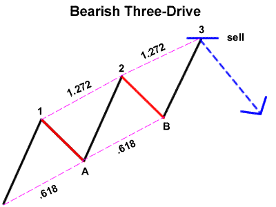
So onto our triple tap / 3 drive pattern: yet again, I find the original explanation and means lacking clarity and ease of use. Most people initially see these drawn out examples, something that looks like this:

bearish-three-drive

Not a recommendation!!


Looks great, right? But the problem is twofold: 1. the measurements themselves may or may not be accurrate and 2. the location of these in a live trading environment. And this is one of Elliot Wave theory’s more common hindrances: the ability for people to translate the above into a live, at-the-market situation. Practitioners will argue otherwise, but they have experience working heavily in their favor (as it should be). Price doesn’t look anything like this. It shoots and shifts all over the place. Locating waves and their subs can be very difficult, and most people give up before they even really start.

Some initial observations about the drawing above:

1. Point 3 is typically 1.618 of the initial drive. You always want to give that leg more room because new money is getting in based on the first instance. This new money enhances length of the movement.

2. The dotted lines labeled 0.618 might, or might not be. Sometimes yes, sometimes no, but ultimately it is not consistent and should a trader assume they were they might find themselves getting destroyed on a trend continuation, which happens all the time.

In other words, it is dangerous and unrealistic to make assumptions like these. Any market is harmonic to the point of what just happened before it, but not all the time.

I have a lot of experience trading these by now. Here are my observations:

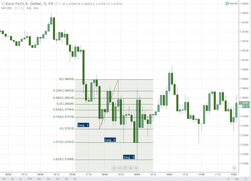
1. 1.272 occurs on the second point.

2. 1.618 occurs on the third point.

3. Up to 4 points can occur. If this is the case, #4 typically coincides with a 2.0 extension.

4. Everything gets measured from the first drive.

Here is a real example, found on a 5 minute timeframe:

Measured Triple Tap

Triple Tap, Measured

There are TWO primary situations in which you will find these.

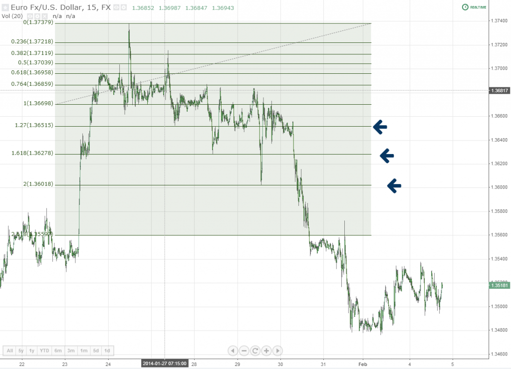
1. Against the macro trend (creation of a new) – no major fundamental stimulus is present and buyers and sellers are still attempting to latch onto the major, preexisting trend.

The inspiration for this post comes form this recent move on EUR/USD, which exemplifies the above. What’s happening here is rather obvious and based on my findings above. This also happens to be in the right scenario, with the proper circumstances:

3 Drive Tripe Tap Pattern EURUSD

Measured Drives Against the Trend

Briefly explained, we measure the first drive. A hit on 1.272 opens the gates to 1.618 as a responsive level. Then down to 2.0. These are of course countertrend, but that’s the point.

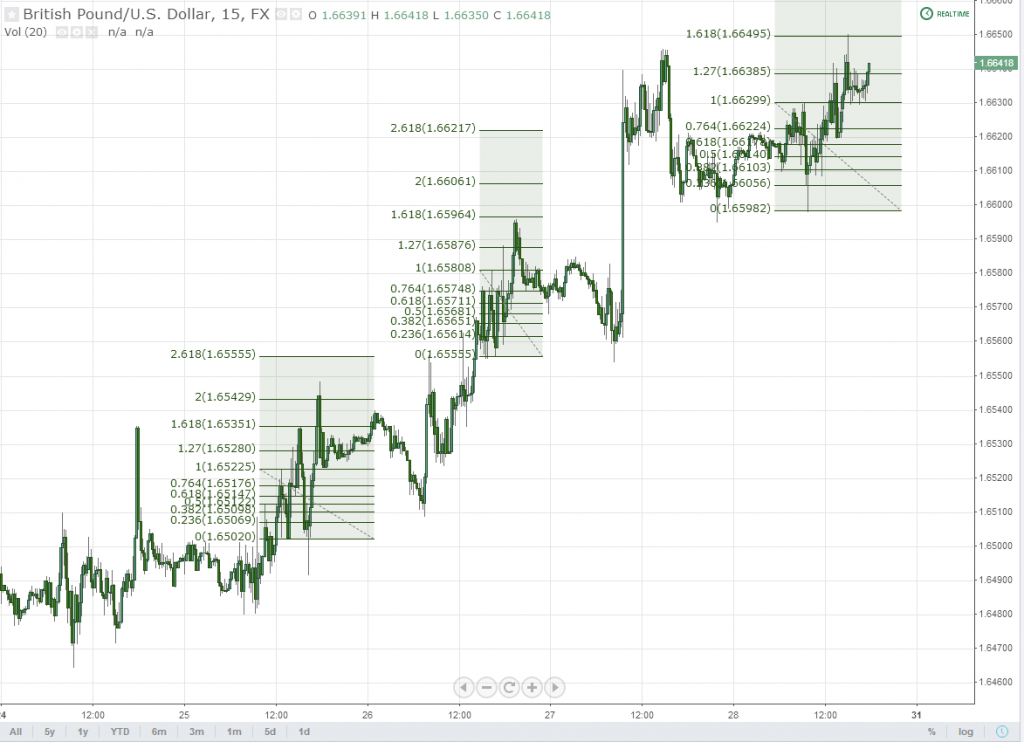
2. Within the macro trend – As temporary stalling points for price. I trade a lot of these intraday to boost earnings, and they offer objective levels for taking profits and capping risk.

3 Drive Price Pattern Tripe Tap Measurement

Measured Drives with the Trend

I shouldn’t need to say this, but these patterns are best used in the context of other levels that reveal confluence to an overall logical stalling point for price acceleration.

This market is extremely technical, which is great. The poor results tack in when following conventional wisdom. Without even knowing it, people tend to abide by certain rules. These rules can be objectified, and our job is to simply find them. Exploiting anomalies in human behavior is what trading really about, in my opinion. You have to see the forest for what it is: a bunch of trees. If you envision a bunch of leprechauns hanging out next to the rainbow then you’re going to get yourself in heaps of trouble.

The rubber rarely hit the road at any given moment in this market. This is very much like most other more liquid markets. It is, in fact, rare to find a market these days where this occurs. And this is precisely why adaptability and the understanding of the human element is crucial. These patterns simply demonstrate human behavior, whether intentional or not.

The “Rule of 3”, when it comes to drives, can be objectively measured in order to arrive at logical and precise turning points. But use it wisely, and understand that the ultimate yield on the trade will only be commensurate with the macro environment. There are truly endless ways to trade these; this is yet one more exception.

——

And that’s it for today. As I think it is obvious, I have been rather busy these days but with more time opening up soon. As usual, please feel free to post any comments below.

Thanks,

Steve


5/5 (4)

NBT is free and has been since 2008. Help us out and rate our content!

The post Triple Tap / 3-Drive Measurement and The Rule of 3 appeared first on No Brainer Trades.

Trading High Probability Shock Announcements – Interest Rates Edition

$
0
0

I have had some pretty good success this past week selling into this EUR/USD move and thought I would write about a few encouraging things that happened along the path. Euro pairs have been running, and running well, and so daytrading takes a back seat for a longer term play that doesn’t exactly happen everyday (but probably more often than you think).

Trend trading can turn into a quick disaster for most people because there is no doubt (in the case of major currency pairs) that the market fades more than it tends to run. But when you have the kind of stimulus like we did last Thursday, there is only one thing you ever need to do: sell. The market does not pull back on unidirectional interest rate announcements that come out of the blue. It never has and likely never will.

Rates can be a blessing or a curse

For a long time, I had a post-it note attached to one of my monitors that read “Don’t screw with rates”. The word “screw” (because there is no time for eloquence) was my way of saying “fade”. If you fade an announcement like this, you metaphorically die in the currency trading world.

One of the worst hits I have ever taken followed an announcement that I did not understand at the time, and boiled down to rates. You never forget these. The market was fast, and I my regularly scheduled stop loss wasn’t set. When the push lower came, I wasn’t prepared with half the tools I am today, and so I need not say what happened next.

There are a couple articles posted on this site now that refer to a range of trend trading tactics. I wrote them mainly in reference to your “standard” currency trend, and there is no doubt that this kind of trend differs greatly from your standard variety. This is the main article I am referring to. So is the strategy all that much different in this case? The quick answer is no, not particularly. You just need to know what you’re dealing with from a fundamental perspective.

Anyone that “questions” whether or not EUR/USD would collapse the way that it did following this announcement should not be trading with any kind of real money in my opinion. This is 101 stuff in my book, though you will probably not read it in most others. Here is the EB summary via Ransquawk:

ECB SUMMARY: Draghi’s unexpected bomb shell that the governing council is comfortable with acting next time resulted in a sharp reversal in EUR/USD and bull flattening of the Euribor curve, on speculation of easing of policy in June…

– Specifically, having failed to break the key 1.4000 level (touted barrier level) to the upside earlier on, as Draghi tried to avoid answering a raft of FX related questions, the pair has come off over 100pips.

– At the same time, the Euribor curve has reversed initial steepening, with the curve bull flattening amid speculation of easing by the Bank next month when the governing council is presented fresh macro projections. Consequently dragging Bunds back into firm positive territory.

– Looking elsewhere, in spite of growing expectations of more accommodative policy, which also resulted in further peripheral bond yield spread tightening, this sentiment has failed to filter through into European equity indices to the same degree.

– A number of economists at tier 1 banks have suggested that the Bank will wait until June to introduce any new programs.

So the result?

Mario Draghi Easing Bomb


So how do you take advantage of a move like this?

Step 1, as I previously mentioned, is to understand what it is you are dealing with. And as usual, if you don’t understand it, then (do I really need to say it?) don’t touch it.

This is a shock announcement. The market didn’t see it coming so there was no way to “price it in”. The market prices in information as it receives it. This is why many news events turn into complete duds when the actual number comes in line with the expected number. Anytime you have a surprise you get a shock in price, and if it has to do with interest rates, it is unidirectional, aggressive, and big.

Step 2 is, based on what we just discussed, knowing what a “normal” movement is for something like this. Every scheduled news event has one of these. For instance, US retail sales was just released today, which usually constitutes a +-20 pip move on USD/JPY, for the deviation that came out (it moved approximately 27 thus far, 23 following the spike). Obviously an announcement such as our main topic today is going to be much more substantial, which is where we really want to take note.

Step 3 is to find your pauses on the way down, and then trade into them.

What I will usually do is mark up my “reversal” areas first – these are the support lines that are going to generate the larger pullbacks, thus some of the better opportunity to get short. Most of the times these coincide with logical areas where people would take profits on a drive lower, as such:

EURUSD Measured Move Lower

I am fairly certain that no one with an ounce of common sense would recommend fading these intraday, and on a move like this. End of story. There is just too much heat on the pair and you’re spinning the wheel in terms of probability. Wait for the pullback and do the right thing.

In fast markets, people usually don’t have too much time to do all that much so they tend to use:

1. Local support turned resistance or

2. Major lines already on their charts

Typically, the first of these is the go-to. Here the same chart, scaled down to a 1 minute.

Local Support and Resistance

Line 1 is a heavy confluence support level from the previous range

Line 2 is an absolute low + spike base from the previous range

Line 3 is local resistance + triple tap

I also drew up a lower channel triple tap, demonstrating the support even in a heavy move such as this.

So not exactly quantum physics here, but rather a heightened level of awareness.

Takeaway

Trading does, most of the time boil down to nothing more heightened awareness and the ability to react on a real-time basis, based on what you see. The fundamental context is just as important as the price action itself, but no doubt takes time to become accustomed to what is considered “normal” on a movement such as this.

But when you see it, do it. There is simply no other way you will become comfortable trading anything without the action behind it. So for once, put the price action on the back burner because knowledge of a few high probability patterns is sometimes all it takes to get yourself locked in on a notable movement.


5/5 (1)

NBT is free and has been since 2008. Help us out and rate our content!

The post Trading High Probability Shock Announcements – Interest Rates Edition appeared first on No Brainer Trades.

How to Avoid Getting Slaughtered by V Tops and Bottoms

$
0
0

Today I decided to write about something that rarely gets attention, although is easily classified as one of the major killers for both discretionary and systematic strategies. “V” tops and bottoms of course occur in any market, and are simply sharp reversals in which price accelerates into a level, and then abruptly fades it.

Because this market is so highly prone to both high quantities of pending orders and quantitative strategies in which high volume moves are quickly traded, V tops and bottoms can be common occurrences.  I recently showed an energy trading friend of mine a simple 1-min EUR/USD chart, and I was a bit taken aback by his immediate comment. He said it looked “digital”, meaning that range reversals appeared sharp and more or less not created by your average Joe traders.

My response was something along the lines of: “Well, that’s because it is. Don’t you know that SkyNet controls these markets now?”. And there is truth, of course, to this statement but one thing we all know: these sharp reversals can be the friends of few. But they do happen, and we should know how to manage them at their inception.

Step 1: Know the drivers

The majority of V tops and bottoms are caused by one of two things. Knowing this alone will have you on alert and better prepared in the event that one were to occur. They are usually accompanied by either:

1. News / data of some form, in which the market shows an initial interpretation, which is quickly forfeited for the longer-term one.  We see this a lot in the FX market when a high ranking government official says something that is quickly traded, only to be digested, with the initial reaction later being faded.

We saw this happen just last week when the ECB’s Constancio came out and essentially confirmed what was already known by market participants. Earlier in the week, ECB President Draghi stated the same, and the downfall of EUR/USD ensued. Being already “priced in”, one could classify this as an exaggerated movement, thus soon thereafter, fading.

Forex, Exhaustion Gap

2. Exaggerated movements in price, in which overshoot is present. A V top or bottom closes the “gap” from which the overshoot originated. In this instance, a common topping or bottoming structure is busted, only for price to race even further, and quickly. These can usually be measured to find a base using any of our common measured movement themes. The example below highlights action on our last NFP announcement, which no doubt surprised more than a handful of traders.

V Bottom Price Pattern


There are other primary drivers for these of course, with the flash crash immediately coming to my mind, albeit rare as they are. Most of them, however, can be classified into one of the two groups listed above.

Step 2. Know the anatomy

V tops and bottoms are just like any other reversal, with 2 distinct characteristics:

1. They occur in less time

2. Pullbacks are shallow.

….hence giving to the name itself. The major weakness of traders when it comes to dealing with these is the immediate momentum. After seeing that price is moving aggressively in one direction, it can be difficult to switch gears into thinking that it will fully reverse and eat up all of the previous gains / losses.

V tops and bottoms are usually nothing more than exhaustion gaps. Those of you that have been following this site for some time may or may not be accustomed to my term “liquidity gaps”, which you can find more about here: http://www.nobrainertrades.com/2011/05/liquidity-gaps-and-spike-removals.html .

The term “exhaustion gap” is far from new, and describes price “exhausting” after a gap is created. Our “gap”, in this instance, is the overshoot. And when the overshoot fills in the case of an exhaustion gap, there is no fade. Price simply keeps on moving past it, as shown in the examples above. This is a relatively constant matter, and I strongly advise against fading the origins of these in any circumstance.

V tops and bottoms also tend to respect traditional support and resistance lines / order clouds. Quite literally the same rules apply with these reversal points as they do with any other; price just gets there a whole lot faster.

EURJPY V Bottom

Step 3. Find your reversal point

Amateur traders tend to love volatility for obvious reasons, which we won’t get into now. Reacting quickly enough to come up with a lower tiered target is a very difficult task, though required. It should be the first thing you do. Without knowing this, you are essentially rolling the dice trading of these on a discretionary basis because you simply won’t have backup conviction otherwise.

Moreover, these movements will tend to happen abruptly and in fast form. Latching onto the initial movement is simply not easy unless you are quick enough to find an obvious point of propulsion. Again, prior to making any attempt to latch onto one of these, know this level, and ensure it is a rational one.

Step 4. A Few General Rules About Fast Markets

Support and resistance levels that tend to get respected in faster markets are usually found locally and easier to identify. I would think this is due to nothing more than the fact that traders simply don’t have the time to go digging for much more and use local levels in order to enter positions that go with the flow.

I have more or less gotten used to the fact that once volatility begins to settle in, I start looking for support or resistance in local ranges. It is more of an issue of practicality for me than anything else.

Trading volatility means larger movements in a shorter window of time. As with any fast market, drilling down to a lower timeframe with give you the type of detail normally seen on a higher timeframe. This can also translate to more risk for traders so adjust accordingly.

AUDUSD Inner Trendline

Step 5. Be prepared to trade momentum.

This is no doubt one of the more difficult steps for anyone to get used to. Those that do this, and do it well, are usually the ones that end up making more money and in general, a little more highly coveted. Trading into momentum after a reversal has already occurred is something I highly, highly encourage anyone reading this to get used to.

Trading is much more than finding an entry point, as I rant about all the time on this site. It is all about being able to forecast a chunk of price action and trade it accordingly. A reversal isn’t a full reversal until the macro trendline has broken. In the case of V tops and bottoms, these macro trendlines are very parabolic. And as I mentioned earlier, do tend to be respected, but you will need a smaller timeframe to find them.

I am not a fan of 1 minute charts unless I am trading something that absolutely requires it, such as volatility. The more macro I can be as daytrader, as far as I have always seen it, the better.

Price Action on GBPUSDOf all the items on the list above, number 1 should take the highest regard. There is zero doubt that the majority of people losing money daytrading have done so by engaging a target that they don’t understand. For the amateurs, leave the price shocks and volatility to the professionals and / or their machines. For everyone else, drill down, be alert and expect what what most people simply do not.

4.5/5 (4)

NBT is free and has been since 2008. Help us out and rate our content!

The post How to Avoid Getting Slaughtered by V Tops and Bottoms appeared first on No Brainer Trades.

A Quasimodo / Over and Under Price Pattern Revision

$
0
0

I have been treating this blog like a personal log of observations for years, and one of the first patterns I wrote about was the over and under (nicknamed “Quasimodo” by some of our members).

The bulk of my trading consists of a simple set of processes:

1. Fundamental landscape, which for me translates to “how humans (and their machines) react to fundamental data”

2. Stage of a trend. Depending on the timeframe I am trading, I want to see at least 2 movements. I will enter on either the first or second piece of a movement, to a predefined target.

3. Measured move / target. There are countless targets available to traders. What I classify as a “natural” movement in price typically results in approximately 1.5X+ the movement leading immediately preceding it.

4. A handful of entry patterns that happen either at bottoms / major reversals, or in the context of a trend. Over and Unders are one of them.

Why do we like this pattern so much?

Over and Unders follow both conventional and non-conventional price behaviors. Conventional in the sense that they essentially nothing more than the beginning of a head and shoulders pattern. Unconventional in the sense that they follow our rules for inner trendlines and confluence points.

But there is much more to this little pattern than I initially discussed. When I wrote about these many years ago, I had one extra “qualification” that required price to move beyond a specified high or low in order to demonstrate a commitment of buyers or sellers. In many cases, however, you will not find this to be the case. As a result, you will be missing out on a considerable amount of opportunity.

Over time, I have realized the the contextual value of any pattern is of course much more relevant than the pattern itself. After all, there is a reason that most price patterns demonstrate much better behavior when found within the context of trends. Common sense should tell you that your performance should get a bump simply when conditions are prime, by latching onto underlying macro movements.

Context Overrules All

I put particular emphasis on price patterns found within trends for the simple reason stated above. These “rules” stand true in any market. So for today, we will think less about the extra qualification previously stated with this pattern and take a look at the pattern itself with a solid contextual reference.

This same methodology stands true for any other continuation / reversal pattern (more specifics in upcoming posts). As I mentioned earlier, there are really only a handful that I use (6 to be exact). They are:

  • Triple Taps
  • Over and Unders
  • Double Top/Bottom Pullbacks
  • Double Top/Bottom Fakeouts (where a double bottom or top is exceeded by a small amount)
  • Square roots (Top or Bottom followed by a lower or higher double top or bottom)
  • V tops or bottoms

My workday is essentially a constant hunt for these (all the better when there is a combination of them), usually with declining volume, and a simple count of legs and identifying targets. And so for today, we will only worry about Over and Under‘s.

Over and Under’s are More Common Than One Might Think

As with any patterns I seek, abundance is a word I like to use in relation to them. If I can’t see them everywhere, then I know I am dealing with nothing more than an anomaly. The following chart demonstrates just how common of a pattern these really are. Many of these are of course legitimate head and shoulders patterns as well:

Over and Under Quasimodo GBPUSD Forex Chart


Before you let your mind wander on what each of those levels might represent, I want you to bear one word in mind: yield. Which of these patterns provided the best return, and which ones did you have to “fight against” a little more in order to turn a profit?

The answer is as obvious as you would initially believe it to be, and the shorts as a whole paid off more than the longs (on this timeframe). This is not to say that the longs didn’t provide some help as well, but if we are looking at these trades from a safety standpoint then the choice is clear. When found in the context of trends, Over and Unders (and any other pattern) will give up more yield and at a much faster rate than countertrend.

Below is a more recent chart displaying 2 trend following trades, confirmed with Over and Unders, and one reversal:

GBPUSD Over and Under


There are some patterns which are extremely popular: head and shoulders is one of them. Because of this, traders take note when that right shoulder is set in place. These patterns are so popular to the point at which, when a “right shoulder” is seen on a higher timeframe some form of a scalp can very consistently be made with them. A minimum target on these is going to be the neckline itself, with of course a break of the neckline signifying further follow-through in classic head and shoulders form.

In trend following situations, this neckline is going to come very, very quickly of course and so I recommend using measured movements on a more macro scale in order to define your target. As an example:

AUDUSD Over and Unders

Here we have a series of Over and Unders found within the context of a trend. Those of you who become “scared” at trading smaller timeframes please bear this in mind: many of these are NOT visible on higher timeframes. We have a clear trendline break to the upside, and you, as a trader, want to get in. In order to find these smaller patterns, you’re going to have to scale down.

You can see from the chart that range-based measured move is applied to find a reasonable intraday target. As I write, we are getting 3 shoves to the upside (in a parabolic move), insinuating short-term slowdown. There is also another Over and Under at the peak of price, this very moment (not shown in the chart but explained below).

As far as other patterns on this chart are concerned (used for the purpose of entering this trend) they are there, but I am going to save them for future posts. This pattern in particular is easy to identify and happens very frequently. Witnessing these, in the example above, accompanied with bullish bar behavior thereafter is a prime example of what I personally, actively seek on a regular basis.

Other Pattern Mash-Ups

Over and Unders will commonly appear with other patterns, such as triple taps, as well. In the case of triple taps, the second to last shove is used as the point at which price ricochets. Let’s take a look at another example:

EURUSD Over and Unders

Being a 3 minute chart above, once again, more detail can be found. From left to right on this chart, we have a wider channel turning into a sharp drive, and then another small “channel” which is essentially a tripe tap. Within the context of all of this, you have smaller, intraday patterns such as these that can be used to latch onto the underlying movements.

Note that with many of these, the “right shoulder” can be created very soon after the actual lowest low or high. After that, it becomes a matter of breaking trendlines. Bullish or bearish bar closes directly ahead of the opposing trendlines (not shown) will suffice.

The Falsity of “False” Breakouts

One term I have never cared for is “false” breakouts. There is nothing “false” about these. It is normal market behavior: no one is out to “fool” you, no one is out to “get” you, it’s just price exceeding a certain level, picking up more order flow, and reversing. Most of the time, it is the result of last minute trend followers latching on for a quick trade, and others reversing at better prices.

When an Over and Under is in place, you may hear the masses calling these a “false” breakout. In my opinion, those using the term “false breakout” are regularly getting fooled themselves.  They believe that their support and resistance levels are essentially written in scripture and when they are broken, the “big guys” are running them down (well the second part of this sentence is true). Two little rules rules will keep you out of this mess:

1. Expect it

2. Understand what is normal market behavior

Price running down levels is all a part of a day’s routine. Stay on the side of the trend, and you’ll be the one running then down.

Using smaller, intraday patterns such as these are going to allow you to latch onto the correct movements. In future posts, I’ll cover the others listed above. As usual, my work/life schedule doesn’t allow me to update this blog as much as I would like to, but these are some solid beginner points to use as a framework and add to your trading arsenal.

5/5 (10)

NBT is free and has been since 2008. Help us out and rate our content!

The post A Quasimodo / Over and Under Price Pattern Revision appeared first on No Brainer Trades.

5 Trend Following Rules That Have Bailed Me Out of Trading Purgatory

$
0
0

In an effort to keep this site moving along I wanted to dig a little more into the trend following category today. There are few explanations I have ever read that leave me truly satisfied in terms of how to trade a trend properly. Over the years I have adapted my own methods to latching onto preexisting movements.

First and foremost, many of the materials written out there in reference to trend following tend to ignore the type of trading environment that is underway. And while most people might say something like, “well, the environment is a trend, dummy“, this kind of explanation is broad, vague and can mean any number of different things.

Trends move in stages, and depending on the driver and time at which you are observing the trend, have varying intensities that need to be handled differently.

In short form, I wanted to outline a handful of points that have bailed me out over the years and put into practice to this day.

Rule #1: Expect the continuation.

Yes, while I realize this is a very general statement, the truth is that most people do not. I could supply you with here with statistics that point to the retail bloodbath that ensues anytime an aggressive trend is underway, but I’ll spare you.

Expectation of the obvious is something people tend to lack in this business, I suppose in part to the fact that he or she thinks that someone or something is always out to fool them, or some other counter-intuitive thought process. If you expect it, you can not only be prepared for the good, but the bad as well. Most trends will give up something on a pullback as opposed to none, regardless of the stage at which it is being traded. The exception to this statement are V tops and bottoms, which have their own characteristics.

Rule #2: Trends move in stages. 

Expecting the continuation of a trend works only as well as the point at which you are trading it. “Drive, Channel, Drive” or “Channel, Drive, Channel” are just two of the ways I’ll use to describe the evolution of just about any trend. And even within these larger, more macro patterns you’ll find substages on lower timeframes or tick intervals.

For instance, many trends complete with a small channel, which is essentially a triple tap following a sharp drive. This drive is what many people would consider “aggressive” behavior. And by the time this behavior comes to light, many daytraders are just starting to switch gears and think that prices are going to continue, when in fact they are witnessing nothing less than the grand finale.


Trend following environments

Rule #3: It is easier for a trend to continue vs. reverse.

Forget about your major support and resistance levels, order flow, etc. etc. in front of the freight train. They will all go bust if the stimulus is strong enough. And trying to “scalp” against these is like picking up pennies off of the train track. It is, for the most part, a useless exercise that almost always ends in ruin. Latching onto the preexisting movement is much easier and about 10X less painless.

Rule #4: The inception of leg #2 tends to drive the most confusion.

Trends can be cut up into “legs”, which essentially distinguishes drives, or sharp movements from one another. Leg #2 gets hairy for a lot of people because this is the leg that can either 1) fail and the previous trend continues or 2) continues, establishing a new trend.

In trends, leg #2 will fail and the preexisting movement will continue. Prices take an intraday pause, reverse, only to fail at more attractive prices for trend followers.These legs themselves can be cut up into two distinct movements and trading accordingly.

Failed 2nd leg in trend

Rule #5: Without anything to dictate otherwise, trends keep moving.

While not as aggressive as the inception, trends will indeed continue should no other counter-stimulus take over. This “rule” can be witnessed many times, over centuries, not just decades, and in most markets. For example, I subscribe to a newsletter written by a guy that most people would consider a “permabear”. Since 2010, I have been reading weekly about a range of indicators that always point to the death of the world equity markets. The problem with most of these “indicators” (which are a mix of fundamental correlations, volumes and technicals), is that people give a rat’s rear end about them and are focused on a much bigger picture.

People have been there, done that. If it happened the last time (whatever it might be), it will likely not happen again. We learn from our “mistakes” and trade things in a different way, based on our past experiences.

This does not deter from simple supply and demand, however. If the demand is there, people will buy. If a lack thereof, people will sell. This much never changes.

Others? Please post them below. Needless to say this is a topic that is hard to exhaust.


5/5 (5)

NBT is free and has been since 2008. Help us out and rate our content!

The post 5 Trend Following Rules That Have Bailed Me Out of Trading Purgatory appeared first on No Brainer Trades.


Trend Continuation, or Failure? An Analytic Roadmap.

$
0
0

A couple of weeks ago, I posted up a few quick notes in regards to some trend following rules in order to get this blog moving again. Today, I am literally writing a response to a question I received in the comments. Like most questions I get, they are not easily answered in one or two sentences. But because the situation can be so delicate and difficult to navigate, I wanted to explore it further. So let’s get on with it:

The question was in regards to whether or not trends will continue or fail when a flag is seen going against them. A lot of traders get hung up on this concept and trapped in what usually turns into a very ugly situation. Here is the chart (copied from last week’s post) in question:

Failed 2nd leg in trend

Essentially we have what is commonly regarded as a “bullish” flag created in the backdrop of a more macro, bearish environment. The flag fails, triggering heaps of orders prime for dissection, and the trend continues lower. There is also another example of this happening in the upper left quadrant of this chart (which is also an over and under).

So the mystery: how do we know this flag is going to continue, or fail? There is no cut and dry answer for this, but more than a few tools to help us out. I’m going to cover these in list form, but in no intended order, in an effort to make this easier to understand:

1. Has a macro trendline broken and /or local levels being used as support?

Such a simple question, but for some reason many people either want to ignore it or believe there is some other complex method coming into play. When the flag is created above a more macro trendline breaking, and the flag itself is being supported by a local structure, the directional bias has gone no where.

In the example above, the macro trendline went bust right at the inception of the first drive (shown below). This is very normal behavior and does not mean that a trend is over. In most cases, it simply means that the trend is simply starting to expand. After the initial fanfare goes away (the reason why everyone was selling so aggressively) profits are taken and price relaxes.

macro trendline

And then there is the story of local levels. I always prefer to use local levels in order to assess short term momentum.

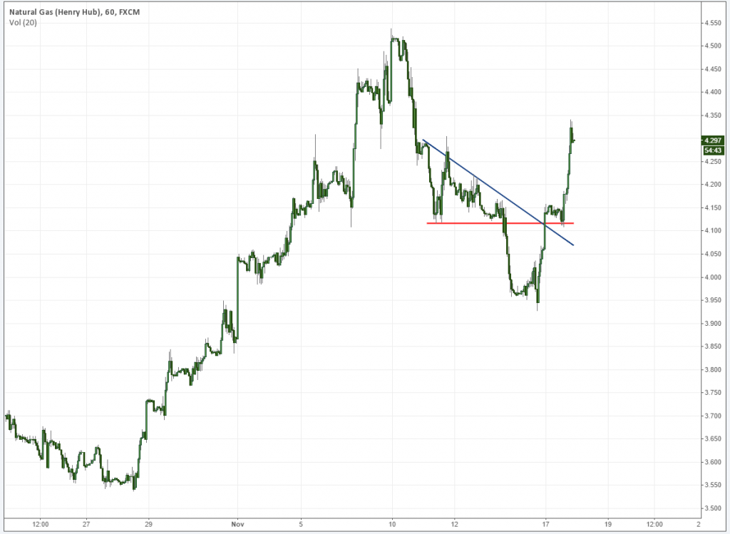
A perfect example of this occurred on Natural Gas today (I have been trading it a lot these days due to where I work). Price broke above the more macro trendline and Over and Under support to propel it higher. Note the lack of countertrend rejection after the initial spike (discussed below), and that the movement itself was targeting a spike base.

Natural Gas Technical Analysis

2. Look for condensing flags in the direction of the movement.

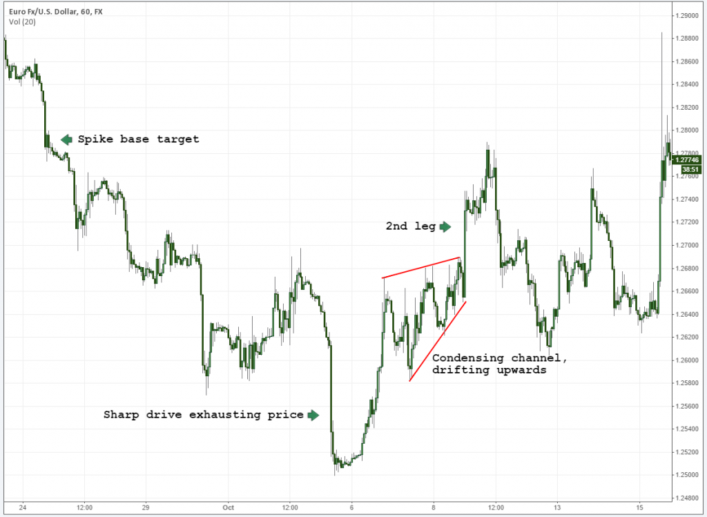
Expanding prices tell us that the market is getting “confused”. An opinion is present in both directions. This indecision tends to take time to fan out before a direction is declared. Your “best friend” flags (that point to a second leg) come in the form of condensing channels that drift in the direction of the movement itself. As follows:

EURUSD Condensing channel

Prices shot higher, and immediately started to condense. While being rejected, the local base held up as the peak itself condensed further. Eventually, of course, it broke out to the upside.

This topic can be exhausted in and of itself. You will notice that the condensing channel above is essentially a triple tap that continues trading higher. Triple taps that fail versus those that continue have very distinct characteristics. I’ve already started writing a post regarding this and plan on getting it up soon.

In a nutshell (as in this case), prices remain condensed. They never expand (break below the lower channel line).

3. Look at the structure leading into it. Was the move itself sharp, or a drifting channel?

This is subtle, but very important. Prices like to exhaust on sharp drives, or what most people would consider to be “aggressive” behavior. Modern quants have amassed fortunes on time-sensitive volatility like this, and a lot of turnover is expected. When prices don’t finalize with a sharp drive, they can be completing nothing more than a standard cycle. The chart above has already shown this, where we have a rather parabolic movement leading into an ultimate failure in price.

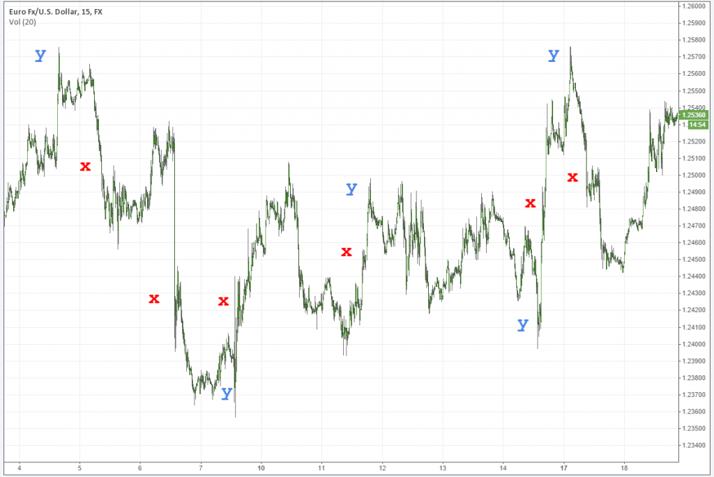
Volatility is most commonly found in two key places: at the inception, and towards the finale of trends. The first of these (the inception) is more difficult to asses. These “easiest” instance in which you will find this happening is when you have a counter movement leading into the reversal, which is sharp (think V reversal).

In the following example, red “x”‘s mark breakouts in an opposing direction. Blue “y”‘s demonstrate sharp movements that get rejected. Please note that I tried to not get too carried away in marking it up, and omitted anything that would not be considered more volatile.

When looking at this chart, think about what is happening after the “y” spike occurs, and whether it is fading or following the trend. Note that red “x””s that follow blue “y”‘s generally result in easier-to-identify outcomes.

xychart

4. Mind the local structures

Double tops and bottoms escape the radar of many people. I assume this is only because they are widely misunderstood. When seen on a short term basis (and more importantly, in the context of a trend) they tell us a compelling story: Pressure is in the area, and local attempts have a high rate of failure. Highs followed by lower or higher double highs complete a common pattern (which I refer to as square roots, based on their shape alone). When present in flags, these are essentially warning signs that bears are out hunting and ready to keep the macro move rolling along.

Square roots

5. Look for high rates of rejection

Individual bar patterns can also be used appropriately because we are, in essence, still trading a trend. To the left of the chart above, we can clearly see that the market was rejecting these highs with earnest.

I’ll use hourly charts to look for high rates of rejection on individual bars. While certainly never the end of the story, they tend to be very absent from moves that ultimately reverse the trend and turn into a second leg. You will notice that in our second chart above (Natural Gas) you’re not going to find a high rate of rejection after that first leg higher. And on our second chart, rejections were present, though we experienced condensing drift in the move higher.

Also, I should note here: when these bars get “eaten up” (a close in the tail portion of them) – follow that move. It’s not stopping.

6. Finally, what are we bouncing off of?

The market will “trap” the rest of the market in a trend, using older areas of supply and demand as a propulsion zone. In trends (and at the inception of trend reversals) prices like to reject these areas on a consistent basis.

Our old friend the spike base demonstrates this behavior happening over and over again.

1. A heavy injection of supply or demand enters the market.

2. Price starts to consolidate, and fresh pressure enters.

3. That fresh pressure is used as a propulsion point in the future.

Bear in mind that spike bases can be used just as much as targets as they can a point of failure, so trade accordingly. Always be aware that markets are drawn to these like super-magnets.

trapped long positions

The Perfect Storm

In most cases, you’re going to find a confluence of factors, in which case you’re of course going to want to take action. The tighter prices wind, the more prone they are to a breakout. Just be sure that you’re on the right side of it.

In summary, assess your overall environment look at the drift of the move, and whether or not prices are condensing or expanding. Use local structures as well as individual bar patterns to see beyond the uneducated obvious. Gauge your momentum, and you should find yourself in a favorable situation.

And so that will do it for this week. As usual, please post any comments below and give us a hand by sharing this article if you found it all useful.

Thanks and good trading,

Steve

5/5 (4)

NBT is free and has been since 2008. Help us out and rate our content!

The post Trend Continuation, or Failure? An Analytic Roadmap. appeared first on No Brainer Trades.

How to Exploit Crude Oil in Its Relationship with Currencies

$
0
0

Finding any form of leading indicator for just about any market is perhaps one of the better tools at your disposal, as the anticipation and confirmation of a major shift is already present elsewhere. Correlation analysis is one of the most constant methods used by macro traders in order to asses future opportunities for this reason, as variances are sought in order to extract profit.

Of common correlations, the crude oil/currency relationship is perhaps the most widely discussed yet greatly misunderstood. USD/CAD is the most frequently discussed, as Canada is one of the highest net exporters of crude oil, yet most commonly traded. Buy why, and how these fluctuations occur is oftentimes head-scratching material for most people, so today we are going to break down this relationship in a digestible form, providing history and evidence of how these two instruments (oil, currencies) interact.

Before we get too far, let’s start in a very general sense: overall, the U.S. dollar and crude oil have traditionally shared an inverse relationship. By extension, and owner of crude oil is essentially shorting the dollar and vice versa. And while trading correlations is generally considered a long-term approach, short-term value is still very much present. Shocks in one instrument have a direct impact on the other, and the lead/lag relationship will remain constant. More on this is explained below.

A Little Bit of History: The Inverse Relationship of Oil and the U.S. Dollar

The crude/anti-dollar relationship began towards the end of World War II, with the signing the Breton Woods agreement. It established the modern global financial system with the dollar serving as its foundation. From this time forward, the dollar became the central currency that was held in reserve by central banks. The result is that oil and greenback move in the opposite directions of each other.

For example, after 1948 oil traded at $17.68 (on an inflation adjusted basis). These trends remained in place through 1973, when the US abandoned the gold standard and allowed the dollar to float freely against other currencies.

Over the next 7 years, oil rose to an all time high of $116.98 in late 1979, while the dollar experienced dramatic selloffs with traders moving out of the dollar and into commodities. Oil is one of the most popular, as it has always been considered a general hedge against inflation. During the same time, the dollar decreased from $103.50 to $82.47. This is when a reversal began.

A similar shift occurred in 2002, the difference being that the dollar peaked and oil bottomed. In this situation, the greenback reached a high of $115.72 (in 2002) and declined to $84.61 (by 2008). While this was happening, oil increased from $25.82 per barrel (in 2002) to an all time high of $144.51. This is illustrating the inverse relationship between the two asset classes.

Crude Oil Historical Chart

What’s Happening Now

In the last 12 months, these differences have become more pronounced with oil falling from $105.12 to $47.72, and the dollar steadily increasing from $68.68 to $100.31. This is in response to a stronger economic outlook for the US, comparative deteriorating conditions for much of the rest of the G10 and declining demand for commodity prices in developing economies. The extended oil supply in the United States, as well as the Saudi’s refusal to cut supply was a primary driver of crude’s demise.

The combination of these factors is creating a situation where dollar denominated assets are in demand. This has only lead to an accelerated selloff in oil and a rise in the value of the dollar overall.

Apples and Oranges

Over the long-term, the dollar and crude oil have been shown to inversely correlate with each other and in many instances, the dollar’s price movements will lead those of oil. This is due to any number of different factors affecting the supply and demand of crude itself, actions taken by the Federal Reserve or other macro situations where the dollar is valued/devalued versus its peers.

In some cases, added amounts of liquidity with falling interest rates have had a direct impact on demand for oil. This causes prices in oil to lag the dollar. For example, in February 2002 this occurred with the Federal Reserve cutting interest rates after the September 11th terrorist attacks and wanting to restore confidence (in the wake of the Enron accounting scandal). However, oil did not begin to steadily climb upward until two months later (in April 2002).

Conversely, the dollar peaked with the Federal Reserve raising interest rates in 2005. This was partly in response to concerns that rising commodities prices were fueling inflationary pressures. The result is that the dollar reached a high of $99.20 (in 2005) and fell to $84.51 (by 2008). During this time, oil set a series of newer all time highs of $78.09. This trend continued until June 2008 when prices reached $144.51. In this case, the dollar reached its lows in March 2008 and oil followed an inverse pattern within two to three months of the shift in trends for the dollar (in June 2008).

These examples are showing how the dollar will highlight shifts in the patterns of both asset classes first. The differences are that these changes occur over the course of several months before they are realized in crude oil.

This relationship is commonly witnessed on a much shorter-term basis as well, perhaps better serving the needs of swing traders. More on this below.

Canada (CAD) and Norway’s (NOK) Tight Correlation to Crude

When we look at individual currencies having a relationship with oil, we have three primary things to consider:

1. Net exporters

2. Net importers

3. Producers

We then drill down to the most liquid of these currencies. Norway and Canada are the world’s 8th and 9th largest net exporters respectively, and the only ones falling in the G10. Plotting either one of these currencies over the price of crude is going to produce an immediately clear relationship. The below chart illustrates this point, with both USD/CAD and USD/NOK inverted to better display the correlation.

crude oil canadian dollar norwegian krone

CAD/USD, NOK/USD over WTI Crude Oil


Exporters are always going to be the most sensitive as the price of oil is going to have a direct impact on how much money that country is simply taking in, in relation to their overall GDP. One look at what happened to the Russian Ruble during crude’s immediate downfall earlier this year makes this all the more astoundingly clear.

These are the currencies you are going to want to monitor the most in relation to this correlation overall.

So if these currencies are directly related to the price of crude and are traded against the dollar, the net effect is of course an underlying push in the other direction, against the dollar. Add this point to others mentioned above, and we equate crude as very much inversely correlated with the U.S. dollar itself.

What Do the Current Trends Signify?

Recently, the Federal Reserve announced that they will be raising interest rates at some point this year (and we will see how that one goes, as there is still a considerable amount of pressure preventing them from doing so). This is having an impact on both, as the possibility of any shifts will lead to stagflation, when interest rates are rising and the economy is lagging the historical norms.

In April 2014, these changes started with the dollar testing its lows and then moving higher. Conversely, oil reached a high of $105.12 (by June 2014). Since this time, the dollar has moved to $101.30 and oil has declined to $44.72. This is demonstrating how rising interest rates will have an underlying impact on this relationship.

Correlations and Trading Application

As with most things in trading, the biggest challenge of trading two asset classes with any correlation boils down to timing.  As a general rule of thumb, currencies are largely considered the “fastest” market, largely due to the fact that everything is of course based on the value of money alone. The “price” of crude is only relative to the point of how much $1 is even worth compared to other currencies. This is only top of the fact that currencies are far more liquid and traded heavily around the clock, all year long.

There will be times when a divergence will appear, and you’re going to question whether or not such a divergence is going to keep expanding or contract. A number of different strategies become available, many of which are heavily discussed in much greater detail elsewhere. The most notable include:

  • Statistical arbitrage, where standard deviations are commonly used to determine how far apart these instruments really are to one another in relation to x values in the past. In a stat. arb. strategy, a long and short position is typically applied on a volatility-adjusted basis. This is done to take advantage of the variance in correlation (ie short crude, short USD/CAD effectively long CAD) and to seek profit from the two converging. A “synthetic” instrument is calculated in order to determine this (a spread between crude and CAD). There are many, many variations of statistical arbitrage, but this is the most common example.
  • Naked longs or shorts in the “lagging” instrument. As an example, both CAD and NOK are trading somewhat significantly below crude oil currently. A short in crude would seek a convergence to the two currencies.

Our recommendation is to keep it simple. While the dollar is going to have the most significant impact overall, the more macro you get, the less sensitive your rates become overall. Focus on your high-exporting nations first and foremost. These are the sovereigns relying on / are the most sensitive to the price of crude and whose overall value of currency tends to lead the pack. They are as follows:

Top Crude Oil Exporting Countries

Top Crude Oil Exporting Countries Source: http://www.eia.gov/beta/international/index.cfm?topl=imp

How This All Lines Up

Recent charts are showing how oil is currently going through a bear rally. This is expected given the scope of the decline the commodity experienced since June of 2014. Based on what we know, the current levels of the dollar are indicating that prices could move slightly lower. Should the dollar maintain its upward trajectory, crude is likely to experience a second wind in relation to decline itself. You would target a mean between these two, or essentially where the correlation once again becomes intact.

The most important underlying assumption is to watch is the way the dollar reacts. This is because it will normally lead any moves in oil by a term relative to the recent price action. If the underlying trend shifts, this could be a sign that the commodity may have bottomed and is starting to rise. Those who follow this strategy can objectively analyze what is happening and identify strong entry points.

Technical breaks on the dollar, not accompanied with breaks on crude, can be effective. The chart below demonstrates two separate instances where the two were floating in a relative range. The dollar broke out and retested local trendlines while crude took several days to accompany the movement itself.

Dollar Index Over Crude

The US Dollar Crude Oil Relationship

And In The End….

Correlation analysis is a very common strategy institutions always have an will continue to use to decrease their risks and enhance their total returns. The key for successfully trading it requires ensuring that both instruments are diverging from a norm, with no major catalyst pull on either one or the other, without the other.  This means watching how each one is reacting in comparison with their highs and lows. Those who are able to take advantage of these disparities when they are first emerging will realize larger overall returns.

In the case of the US dollar and oil, an inverse relationship continues to exist. The two will trade in opposite directions each other and are influenced by a plethora of monetary / economic factors. This causes them to move in patterns with the US dollar showing inverse correlation first. Then, within relative short order, oil is confirming the underlying trends by moving in the opposite direction.

As with anything, keep your relationships relatively simple. While we have spent a fair amount of time outlining several different factors attributing to the rise and decline of crude and currencies, every correlation needs to be respected for what it is at any given moment. Observation and screentime are always your best friend when it comes to virtually any intermarket relationship, as history does indeed change with driving factors themselves.

For more: 

List of exporters/importers, production, consumers and reserves: http://www.eia.gov/beta/international/index.cfm?topl=imp

Charts and other correlation analysis: https://www.tradingview.com and http://macrotrends.net and https://www.quandl.com/

Stat arb: http://www.nasdaq.com/article/dont-be-fooled-by-the-fancy-name-statistical-arbitrage-is-a-simple-way-to-profit-cm254669 and http://en.wikipedia.org/wiki/Statistical_arbitrage

This post was a co-written by Chris Seabury, a freelance journalist, and NBT.

5/5 (7)

NBT is free and has been since 2008. Help us out and rate our content!

The post How to Exploit Crude Oil in Its Relationship with Currencies appeared first on No Brainer Trades.

To Fade or Not to Fade: Horizontal Support and Resistance

$
0
0

Office was quiet as a mouse today so carpe diem: made a video, answering a question that I have been getting from my early days of writing this blog. Key points:

  • Confluence rules above all. Confluence in identifying the level and especially, confluence in execution.
  • Wait for a natural movement in price. We want to see price completing a reasonable cycle prior to exiting a position or putting on new exposure.
  • Use the inside of the range, not ultimate highs or lows as taught by conventional wisdom.
  • Identification is relatively simple. Just seek multiple hits over and over again.
  • These levels are simply transition points for order flow and rarely go away over time.
  • The more the line is used the more it's “fade” value deteriorates.

Topics used: Basic support and resistance, measured moves on trendline breaks, triple taps / 5 point price structures (ranges)

5/5 (8)

ParaCurve is free and has been since 2008. Help us out and rate our content!

The post To Fade or Not to Fade: Horizontal Support and Resistance appeared first on ParaCurve.

The Essentials of Retail Forex Broker Models | How They Work and Finding the Good Guys

$
0
0

The sell side of the retail Forex industry can be as opaque as the market itself, and few individual traders actually have a clue about how they are being quoted, if their trade is going out to market, and a slew of other concerns that escapes common knowledge. Today we are going to cover retail broker models, common terminology and essentially everything that many brokers don't want you to know. Most of the articles found on the internet, well, most retail traders won't even look at. That is why I'm posting it here, to hopefully better educate the masses and shed some light on a typically dark subject matter. To some of you, this is nothing new, but to others, I hope to better inform.

Transaction costs are a huge concern for us because it is essentially money down the tubes and most of the time, for no reason whatsoever. This is the main reason we largely abandoned a major ECN and went with another that does not attempt to add costs on top of our preexisting PB fees.

The bottom line is that no trader should be paying anything more than around a pip on a EUR/USD during any standard trading session. And yes, on ECN platforms, that includes commission. If this is the case on your platform, then you are essentially donating money to your broker. Again, this is your hard-earned money simply being handed over to someone else, one little trade at a time. This cost can of course be justified if you are getting some serious analysis or tools in return, but most of the time this is not the case and these tools can be acquired elsewhere for much less.

Standard Retail Broker Models and Why Everyone Hates Them

Retail brokers typically fall into several “model” categories, with the larger ones using a combination of these in order to cater to more sophisticated clients. An example would be 70% B-Model, 20% A-Model and 10% C-Model being used within one firm. These are all industry terms and nothing new. Again, I am simply just bringing these into the light. So let's talk about these models one by one:

A-Model: In an A-Model, a broker profits from spread only. Trades are passed out to market via straight through processing to a bank or an ECN through a bank. You will never hear me recommend trading through any platform that does not strictly follow an A-Model. Trade matching technology is simply too good and accessible these days to have to deal with anything less.  In addition to better execution (which is an understatement), as a client, you don't have to deal with any of the more common trading restrictions seen elsewhere.

B-Model: The most common, for a reason. One look at a retail broker's client book and the profitability results are astoundingly clear: it makes much more sense to “hedge”, or trade against your client's positions as opposed to simply passing them out to market and capturing spread. Additionally, a lot more “flexibility” is given to the broker which in most cases, is a conflict of interest with the client (more on this below). Recent CFTC reports indicate that approximately 70-80% of retail client volume is unprofitable. Most retail brokers follow a B-Model simply because it is so lucrative to do so. The largest brokers here in the US have historically followed a B-Model with “good” results (understatement of the century). For clients, B-Models are generally frowned upon, yet encouraged by brokers with the argument that better flexibility is afforded to them. The major cause of concern is of course the conflict of interest and now long history of unethical practices exercised by brokers under this model.

C-Model: More obscure and essentially anything that does not fall into the first 2 categories. C-Models consist of a range of strategies designed to typically balance extracted profit for a broker and client satisfaction.

Liquidity Aggregation

Retail brokers will pull liquidity from any number of major destinations. In the early days of retail FX, the only route to go was to set up a relationship with a bank, or several banks, and pool that liquidity onto their platforms. The broker could then take their route of choice, which usually entailed market making. Today, a number of different methods may be used including turnkey solutions with established sources of liquidity or connecting directly with an institutional ECN. Regardless, a bank's services are still needed in order to hold the account and facilitate a number of operational functions.

Liquidity aggregation is getting more and more accessible these days, with a number of market participants (funds, brokers, you name it) using platforms such as MarketFactory to direct multiple trading venues into one platform on the client side. These technology improvements allow further flexibility for brokers to expand their horizons and offer better conditions for traders of all sizes. Ultimately, the market is improving, transparency gaining traction, and retail traders have more options than ever.

As it stands today, retail brokers will access liquidity by any number of different means:

Direct bank relationships: Single bank platforms or other pass through systems that allow retail FX brokers access to a wider pool of liquidity.

ECNs: A relationship with a larger bank is usually required as well due to the broker's lack of size, thus credit.

3rd party aggregators or all in one solutions: These businesses essentially act as a turnkey solution for everything when it comes to starting an FX brokerage business. Leverate is a prime example. Companies go to these types of businesses for simplicity and negotiation muscle when it comes to acquiring liquidity for their shop.

And Now for Some Badly Needed Explanation of Terms:

ECN: Electronic Communication Network. ECN's have risen in volume substantially over the years and will likely continue to do so, as they have several major benefits:

  • Direct access to liquidity: It is you and the bank / another trader / institution, whoever wants to make a price.
  • Deep liquidity: Prices are abundant on the majors and can generally serve most of the more demanding clients.
  • Limit Book Access: Orders are out in the open. Conventions do indeed vary from ECN to ECN.
  • Superior execution: Due mainly to the above. Note that some platforms will still allow for “last look”, giving the counterparty the upper advantage on your trade.

Retail brokers commonly advertise ECN platforms, but this does not mean that they are a “true” ECN. A “true” ECN allows direct access to the interbank market, where the broker charges you a commission on top of your spread, which even can commonly be inverted. Many “ECNs” labeled in the retail world still pose risk to the client. These are not “true” ECNs but usually a bridge of some sort where spreads are marked up and inventory risk for the broker is still a concern. Major institutional ECN's include Currenex, FXAll, Hotspot, LMAX, etc.

An ECN broker will allow you to trade directly with other participants in the marketplace. You are literally trading on the ECN with the rest of the world, consisting of banks, hedge funds, other individual traders like you, etc. Be aware that some ECNs are only as good as the platform you are using, so ensure you picky in terms of what software you choose to use.

Market Maker: A market maker typically does several things:

Creates a price for you, the client. These prices are most oftentimes “representative” of a true market price and in some cases, your trade will never even leave the retail firm. The market maker will take the other side of your position, sometimes determining whether or not you are an A or B client. If you are an A client, in some cases your trade will be routed out to market, essentially making you someone else's “problem”. This can still cause major issues in execution, however, as your trade is jumping a few servers and usually old technology to make it happen. If you are a B-client, the broker essentially has confidence that at some point, you will wipe yourself out and fork over your money to them.

The vast majority of retail forex brokers follow some sort of market making model. It is still very dominant and allows them the pure flexibility of doing any number of different things, which most people with half an ounce of common sense would consider unethical. Delaying execution, utilizing trading restrictions and popping spreads around stop losses so they are executed are just a few examples of some of the horrendous things these firms are capable of doing. And yes, some of the largest shops will do this. Plainly speaking, it is difficult for some regulatory agencies to detect some of this behavior, such as “spread popping”.  If you want to avoid any of these things then simply stay away from this model. Regulatory agencies will only catch so much, but they are getting better at doing so.

Much of the above described activity is simply illegal in most jurisdictions, but that has not stopped many brokers from doing it. Those who have been caught are usually done by a well-organized regulatory entity, such as the NFA.

The much, much greater majority of brokers who find themselves in trouble do so because they are playing around with the market making model. Granted, not all market makers are “bad”, but the possibility for them to be is much, much greater than those following an A-Model.

Retail traders are becoming more savvy to these tactics, of course, and opting against these types of subpar trading conditions. So it is no surprise that a slew of other services are offered by brokers in order to entice newer traders to come on board.

DMA: Direct Market Access. Just as the name implies. You, the trader, has direct access to the interbank market. This entails you accepting, or if allowed, making a price with any number of counterparties available on the platform. The term is commonly used in conjunction with an ECN model.

STP Straight Through Processing. – Another term that gets tossed around quite a bit, which gives some indication, but not all, as to what model your broker is following. Straight through processing implies that your trade is passed through the broker, direct to their liquidity provider(s). The most common way of distinguishing an STP broker from an ECN broker is that an STP broker passes your trade directly to banks in which they have a relationship. An ECN broker will pass your trades to a true ECN, where you have complete access to a range of participants.

The broker will inflate the spread in order to profit from your transaction turnover and “make up” for the lack of B-Model being employed on your account. They want you to be profitable so that you continue to rack in commissions, but make it extremely hard to do with such high costs. Some of these markups are extraordinary, however, and the concept is laughable. Essentially you are being charged for the “courtesy” of the broker not messing with your trade execution.

Some STP's are certainly more reasonable and offer better markups, or lack thereof. To my knowledge not one “reasonable” STP exists here in the United States that will offer fair costs and pure execution without restrictions, such as severely inflating spreads, etc. STP is still limited, however, in the sense that someone essentially has an upper advantage over you, to state it in general terms.

No Dealing Desk: An “overused” term that gives vague indication as to what the broker is actually doing with your trade, though generally refers to some form of STP. This is thought to imply that the broker is directly following a pass through system, though manipulation with conditions is certainly still possible.

Signs of a Market Maker or “Fake” or “Quasi” ECN aka STP

  • Requotes on any trade. On a true ECN you get a price and take it or leave it.
  • Prohibit any type of trading such as “scalping”.
  • Asymmetrical slippage. This an illegal practice here in the US (and abroad I am sure) where the broker does not give you the benefit of the doubt should slippage be in your favor, yet make you suffer the loss if slippage is against the intended direction of your trade.
  • Hide depth of book. Trade volumes should be visible across the platform.
  • Set freeze levels. Freeze levels are minimum distances for stop loss or take profit orders.

This list is primarily geared towards market makers, many of which have conducted themselves in manners which, well, let's say I highly disapprove of from an ethical standpoint.

“Fake” ECN's or other forms of STP I do not consider always bad, but I don't consider them the best, either. For most retail traders, they will do the job yet be aware that you are still likely to face restrictions not seen by those trading on a true ECN platform.

Some people prefer STP over ECNs in terms of execution speed, as I have heard it is claimed to be better. The bottom line is that when you are getting this technical you have entered a world where much of our discussion here becomes irrelevant.

Getting Access

As previously stated, most brokers offer some form of direct market access, yet they require you to be a “Pro” client, or whatever naming convention they use, in order to get this kind of access. This typically refers to large deposits or large turnover. As this market continues to evolve, more and more brokers are popping up and filling the void in order to grant such access at a very basic level.

The problem tends to arise with white label solutions, usually delivered by firms like Integral or Currenex, which can demand higher requirements. Others have brokered deals where the aggregate volume gets routed in order to compensate. Currenex Standard and Viking, and platforms like it, are being offered to retail clients with large deposits through many brokers.

LMAX is a prime example of a new kind of ECN designed to squash the old retail market making model. For anyone based outside of the US, accounts can be funded with as little as $1,000 through an introducing broker.

For the rest, an ECN is an ECN. Institutional or retail, you still need someone to hold your money and do your paperwork/settlement. That's where your broker steps in, and things tend to get a little murky. Most brokers will charge a simple commission based on some form of tiered volume schedule in order to make money on your trades. Others like to fiddle with the volume. Personally, I don't mind paying a commission for the lack of conflict of interest.

US-Based Clients

As usual, US clients have somewhat of an anvil tied around their necks due to the indirect effects of recent regulatory actions. Like the largest banks after the financial crisis, most of the smaller FCMs ended up consolidating with certain houses in order to meet a number of regulatory requirements. Additionally, costs vs. profit became exceedingly slim, forcing many UK-based firms to hand over their U.S. books to these other U.S.-based brokers with already larger ones.

Unfortunately, most of these larger brokers historically utilize unwavering B-Models unless you walk in the door with $10,000-$20,000 and access a “Pro” account, or face an uphill battle against inflated spreads on an STP model. As a result, setting up a penny practice account on an institutional grade execution platform is far from the easiest bet. If you are able to do this, then no questions asked, pay the commission and get the dirt cheap spread. Also, I recommend going with a company that has a leg in the institutional world (the real one, not wannabes) as opposed to what is stated on their website.

My Recommendations

Transaction cost comes first. Save your money. Those little, incremental amounts add up substantially over time. Experienced traders know this, newer traders see it more of a non-issue. It is a HUGE issue.Do your homework. Sites like http://www.fxintel.com/ can help steer you in the right direction. And no, demo spreads can be very different from live spreads.

Do a due diligence/background check to ensure that no massive red flags have risen in history. For clients based in the US, http://www.nfa.futures.org/basicnet/ is the place to go. Australia, this way please: http://www.asic.gov.au/asic/asic.nsf/byheadline/Introduction+to+ASIC+Connect?openDocument and the UK, right here: https://www.fsa.gov.uk/register/home.do . For firms based in any other countries, I simply don't have enough experience dealing, but I can say that these 3 have some of the higher regulatory standards in the world.

For the NFA, simply type in the name of the firm, hit “GO”, and look in the “Regulatory Actions” box. Have fun.

Also, if you can't find dirt on a firm in one country, they might be registered in another as well. Stay clean. That's my best advice.

Find out what kind of model your broker is using. Again, many larger brokers now offer A-Models in addition to their traditional B-Models. You want to get as close to the market as possible and with as little interference necessary, and at a reasonable cost. If they refuse to tell you, then 99% of time they are B-Model. An A-Model broker would have zero problem disclosing information about what happens to your trades.

Most people slip when they call a broker, ask if they trade against client positions, and are given the ring-a-round to the no dealing desk “model” where they end up being eaten alive by either poor technology or inflated costs. So be careful. Just because a regulatory agency is watching your broker does not mean they are up to no good. Just a couple weeks ago, the FSA went after one of the largest retail brokers in the world because of asymmetrical price slippage. This broker has been in business for years and yet such conduct is still prevalent. So do your homework. The landscape is changing and people are becoming wiser. There is no need to settle for less.

Other Final Considerations

Stay away from any form of fixed spreads. These simply don't help. The broker is either a market maker or using an STP that will work against you when you need it the most.

No platform is perfect, whether they be a market maker, STP or ECN. Again, research.

Find the biggest pool of liquidity you can. A whole world opens up to you. Want to trade spikes? No problem. Want a fill in a few milliseconds? No problem. More liquidity typically translates to lower spreads and while the flexibility might not be needed today, it likely will in the long run.

If you intend on investing anything greater than 10-20k, your options open up substantially. Use them.

Be smart. Choosing a proper broker should not be a rush decision or one based on tools, signals, or any other type of vanity that is essentially the FX world's version of a free buffet at a casino. It's your money. Keep it safe.

Please post any comments below but all I ask is that you take it easy with the names. This article is meant to inform, not bash others. Thank you.

4.82/5 (11)

ParaCurve is free and has been since 2008. Help us out and rate our content!

The post The Essentials of Retail Forex Broker Models | How They Work and Finding the Good Guys appeared first on ParaCurve.

Triple Tap / 3-Drive Measurement and The Rule of 3

$
0
0

Over time, we have talked quite a bit about the “rule of 3″, which is a very common yet underestimated component of trading. And the reason I use the word” underestimated” is because for learning purposes, it could be one of the clearest, simplest and easy-to-follow concept that leads to the most favorable results.

The “rule of 3” could refer to a number of different things:

1. It takes 2 points to create a trendline. The third one will fade. Any hit after the third weakens the line until it becomes buried in the past, at which point its relevance is once again strengthened.

2. In higher probabilistic scenarios, price will exhaust on either a short or long term basis following 3 taps / drives.

3. There are always 3 legs to each major component of a trend. It is perhaps an easier and less confusing means of identifying various stages of a trend. More on this coming soon.

4. When price pauses within a trend, it typically creates 3 consecutive “bucks” prior to continuation.

These “rules” are of course able to be broken according to the other “rules” dictating nothing other than our friend reality. And so they should, in this case, be considered requirements prior to putting on a new position. This is how I treat them, and as usual if I don't see them, I don't take action.

Number 2 on this list (in higher probabilistic scenarios, price will exhaust on either a short or long term basis following 3 taps / drives) gets a good amount of attention on this site. I find that within every preexisting theory, no matter how terrible or broken other people may perceive it, there is a nugget waiting to be uncovered. I treat all of my analysis like this and so I am very hesitant to dismiss anything, as ridiculous as some of it might seem.

A question by a reader on our new board got me thinking about this more than usual during the course of the past week. She brought up harmonic trading. As usual and as with Elliot Wave analysis, when you take everything in aggregate and on a larger scope, it is hard to find the immediate value. The patterns are extremely detailed, thus confusing and difficult to remember.

More importantly, some of these price patterns simply work better than others. It is usually the smaller, more simple ones that work best. The only book I have ever read about Elliot Wave analysis was by Robert Pretcher. To this day, after the countless number of hours spent analyzing my charts, it is not easy to dismiss much of what is written in that book. What I have found so difficult is the suggested means of application. While the knowledge is important, the method lags (at least for me).

Certain forms of price action analysis (trend identification, bar patterns, etc.) certainly can and does lag just like any indicator, and you can't convince me otherwise. Bar patterns, etc., can be considered “lagging” as their completion is required to “confirm” entry or exit.

And so this is why I turn to extensions and other traditional forms of support and resistance. I have had far more success using them as opposed to any other form of chart measurement. It rings clear as a bell to me and the predictive “power” is something I am still impressed with to this day. Over time, of course, my confidence boosts as I have more experience doing it.

But back to those smaller patterns. I will completely admit here that when I started discussing “triple taps” on this site, I completely forgot about the traditional 3-drive pattern. Essentially it's the same thing, but with added measures. And it's funny: I read about it years ago…..how did I miss the importance? #1: it wasn't flashed in my face on a daily basis and goes under the radar in most written material. #2: no one tries to sell you on a hidden pattern so “regularly obscure” as it is.

All of the work on this site is a spinoff / variation of an old idea. I take conventional teachings, try to find the good, and make the nuggets work in manner that makes sense. Readers of this site are exposed to only the more exciting stuff, typically.

For instance: measured moves on trendline breaks…..the original method for drawing the measurement was described by Tom DeMark, but his method for drawing the trendline I found to be lacking in the precision I wanted, thus the measurement was as well. He explained why he found his trendlines in this manner (to quantify them) but that doesn't mean that it is the best way to go about it. When I found a better way to do this, I achieved much better results, so good that they seemed scary as to how accurate they were. They key to doing those was to 1. find the retest in the last leg…..this is how you know you're same page as the rest of the market and 2. line that up with heavy confluence in the previous price range.

So onto our triple tap / 3 drive pattern: yet again, I find the original explanation and means lacking clarity and ease of use. Most people initially see these drawn out examples, something that looks like this:

bearish-three-drive

Not a recommendation!!


Looks great, right? But the problem is twofold: 1. the measurements themselves may or may not be accurrate and 2. the location of these in a live trading environment. And this is one of Elliot Wave theory's more common hindrances: the ability for people to translate the above into a live, at-the-market situation. Practitioners will argue otherwise, but they have experience working heavily in their favor (as it should be). Price doesn't look anything like this. It shoots and shifts all over the place. Locating waves and their subs can be very difficult, and most people give up before they even really start.

Some initial observations about the drawing above:

1. Point 3 is typically 1.618 of the initial drive. You always want to give that leg more room because new money is getting in based on the first instance. This new money enhances length of the movement.

2. The dotted lines labeled 0.618 might, or might not be. Sometimes yes, sometimes no, but ultimately it is not consistent and should a trader assume they were they might find themselves getting destroyed on a trend continuation, which happens all the time.

In other words, it is dangerous and unrealistic to make assumptions like these. Any market is harmonic to the point of what just happened before it, but not all the time.

I have a lot of experience trading these by now. Here are my observations:

1. 1.272 occurs on the second point.

2. 1.618 occurs on the third point.

3. Up to 4 points can occur. If this is the case, #4 typically coincides with a 2.0 extension.

4. Everything gets measured from the first drive.

Here is a real example, found on a 5 minute timeframe:

Measured Triple Tap

Triple Tap, Measured

There are TWO primary situations in which you will find these.

1. Against the macro trend (creation of a new) – no major fundamental stimulus is present and buyers and sellers are still attempting to latch onto the major, preexisting trend.

The inspiration for this post comes form this recent move on EUR/USD, which exemplifies the above. What's happening here is rather obvious and based on my findings above. This also happens to be in the right scenario, with the proper circumstances:

3 Drive Tripe Tap Pattern EURUSD

Measured Drives Against the Trend

Briefly explained, we measure the first drive. A hit on 1.272 opens the gates to 1.618 as a responsive level. Then down to 2.0. These are of course countertrend, but that's the point.

2. Within the macro trend – As temporary stalling points for price. I trade a lot of these intraday to boost earnings, and they offer objective levels for taking profits and capping risk.

3 Drive Price Pattern Tripe Tap Measurement

Measured Drives with the Trend

I shouldn't need to say this, but these patterns are best used in the context of other levels that reveal confluence to an overall logical stalling point for price acceleration.

This market is extremely technical, which is great. The poor results tack in when following conventional wisdom. Without even knowing it, people tend to abide by certain rules. These rules can be objectified, and our job is to simply find them. Exploiting anomalies in human behavior is what trading really about, in my opinion. You have to see the forest for what it is: a bunch of trees. If you envision a bunch of leprechauns hanging out next to the rainbow then you're going to get yourself in heaps of trouble.

The rubber rarely hit the road at any given moment in this market. This is very much like most other more liquid markets. It is, in fact, rare to find a market these days where this occurs. And this is precisely why adaptability and the understanding of the human element is crucial. These patterns simply demonstrate human behavior, whether intentional or not.

The “Rule of 3”, when it comes to drives, can be objectively measured in order to arrive at logical and precise turning points. But use it wisely, and understand that the ultimate yield on the trade will only be commensurate with the macro environment. There are truly endless ways to trade these; this is yet one more exception.

——

And that's it for today. As I think it is obvious, I have been rather busy these days but with more time opening up soon. As usual, please feel free to post any comments below.

Thanks,

Steve


4.88/5 (16)

ParaCurve is free and has been since 2008. Help us out and rate our content!

The post Triple Tap / 3-Drive Measurement and The Rule of 3 appeared first on ParaCurve.

Trading High Probability Shock Announcements – Interest Rates Edition

$
0
0

I have had some pretty good success this past week selling into this EUR/USD move and thought I would write about a few encouraging things that happened along the path. Euro pairs have been running, and running well, and so daytrading takes a back seat for a longer term play that doesn't exactly happen everyday (but probably more often than you think).

Trend trading can turn into a quick disaster for most people because there is no doubt (in the case of major currency pairs) that the market fades more than it tends to run. But when you have the kind of stimulus like we did last Thursday, there is only one thing you ever need to do: sell. The market does not pull back on unidirectional interest rate announcements that come out of the blue. It never has and likely never will.

Rates can be a blessing or a curse

For a long time, I had a post-it note attached to one of my monitors that read “Don't screw with rates”. The word “screw” (because there is no time for eloquence) was my way of saying “fade”. If you fade an announcement like this, you metaphorically die in the currency trading world.

One of the worst hits I have ever taken followed an announcement that I did not understand at the time, and boiled down to rates. You never forget these. The market was fast, and I my regularly scheduled stop loss wasn't set. When the push lower came, I wasn't prepared with half the tools I am today, and so I need not say what happened next.

There are a couple articles posted on this site now that refer to a range of trend trading tactics. I wrote them mainly in reference to your “standard” currency trend, and there is no doubt that this kind of trend differs greatly from your standard variety. This is the main article I am referring to. So is the strategy all that much different in this case? The quick answer is no, not particularly. You just need to know what you're dealing with from a fundamental perspective.

Anyone that “questions” whether or not EUR/USD would collapse the way that it did following this announcement should not be trading with any kind of real money in my opinion. This is 101 stuff in my book, though you will probably not read it in most others. Here is the EB summary via Ransquawk:

ECB SUMMARY: Draghi's unexpected bomb shell that the governing council is comfortable with acting next time resulted in a sharp reversal in EUR/USD and bull flattening of the Euribor curve, on speculation of easing of policy in June…

– Specifically, having failed to break the key 1.4000 level (touted barrier level) to the upside earlier on, as Draghi tried to avoid answering a raft of FX related questions, the pair has come off over 100pips.

– At the same time, the Euribor curve has reversed initial steepening, with the curve bull flattening amid speculation of easing by the Bank next month when the governing council is presented fresh macro projections. Consequently dragging Bunds back into firm positive territory.

– Looking elsewhere, in spite of growing expectations of more accommodative policy, which also resulted in further peripheral bond yield spread tightening, this sentiment has failed to filter through into European equity indices to the same degree.

– A number of economists at tier 1 banks have suggested that the Bank will wait until June to introduce any new programs.

So the result?

Mario Draghi Easing Bomb


So how do you take advantage of a move like this?

Step 1, as I previously mentioned, is to understand what it is you are dealing with. And as usual, if you don't understand it, then (do I really need to say it?) don't touch it.

This is a shock announcement. The market didn't see it coming so there was no way to “price it in”. The market prices in information as it receives it. This is why many news events turn into complete duds when the actual number comes in line with the expected number. Anytime you have a surprise you get a shock in price, and if it has to do with interest rates, it is unidirectional, aggressive, and big.

Step 2 is, based on what we just discussed, knowing what a “normal” movement is for something like this. Every scheduled news event has one of these. For instance, US retail sales was just released today, which usually constitutes a +-20 pip move on USD/JPY, for the deviation that came out (it moved approximately 27 thus far, 23 following the spike). Obviously an announcement such as our main topic today is going to be much more substantial, which is where we really want to take note.

Step 3 is to find your pauses on the way down, and then trade into them.

What I will usually do is mark up my “reversal” areas first – these are the support lines that are going to generate the larger pullbacks, thus some of the better opportunity to get short. Most of the times these coincide with logical areas where people would take profits on a drive lower, as such:

EURUSD Measured Move Lower

I am fairly certain that no one with an ounce of common sense would recommend fading these intraday, and on a move like this. End of story. There is just too much heat on the pair and you're spinning the wheel in terms of probability. Wait for the pullback and do the right thing.

In fast markets, people usually don't have too much time to do all that much so they tend to use:

1. Local support turned resistance or

2. Major lines already on their charts

Typically, the first of these is the go-to. Here the same chart, scaled down to a 1 minute.

Local Support and Resistance

Line 1 is a heavy confluence support level from the previous range

Line 2 is an absolute low + spike base from the previous range

Line 3 is local resistance + triple tap

I also drew up a lower channel triple tap, demonstrating the support even in a heavy move such as this.

So not exactly quantum physics here, but rather a heightened level of awareness.

Takeaway

Trading does, most of the time boil down to nothing more heightened awareness and the ability to react on a real-time basis, based on what you see. The fundamental context is just as important as the price action itself, but no doubt takes time to become accustomed to what is considered “normal” on a movement such as this.

But when you see it, do it. There is simply no other way you will become comfortable trading anything without the action behind it. So for once, put the price action on the back burner because knowledge of a few high probability patterns is sometimes all it takes to get yourself locked in on a notable movement.


4.33/5 (3)

ParaCurve is free and has been since 2008. Help us out and rate our content!

The post Trading High Probability Shock Announcements – Interest Rates Edition appeared first on ParaCurve.

How to Avoid Getting Slaughtered by V Tops and Bottoms

$
0
0

Today I decided to write about something that rarely gets attention, although is easily classified as one of the major killers for both discretionary and systematic strategies. “V” tops and bottoms of course occur in any market, and are simply sharp reversals in which price accelerates into a level, and then abruptly fades it.

Because this market is so highly prone to both high quantities of pending orders and quantitative strategies in which high volume moves are quickly traded, V tops and bottoms can be common occurrences.  I recently showed an energy trading friend of mine a simple 1-min EUR/USD chart, and I was a bit taken aback by his immediate comment. He said it looked “digital”, meaning that range reversals appeared sharp and more or less not created by your average Joe traders.

My response was something along the lines of: “Well, that's because it is. Don't you know that SkyNet controls these markets now?”. And there is truth, of course, to this statement but one thing we all know: these sharp reversals can be the friends of few. But they do happen, and we should know how to manage them at their inception.

Step 1: Know the drivers

The majority of V tops and bottoms are caused by one of two things. Knowing this alone will have you on alert and better prepared in the event that one were to occur. They are usually accompanied by either:

1. News / data of some form, in which the market shows an initial interpretation, which is quickly forfeited for the longer-term one.  We see this a lot in the FX market when a high ranking government official says something that is quickly traded, only to be digested, with the initial reaction later being faded.

We saw this happen just last week when the ECB's Constancio came out and essentially confirmed what was already known by market participants. Earlier in the week, ECB President Draghi stated the same, and the downfall of EUR/USD ensued. Being already “priced in”, one could classify this as an exaggerated movement, thus soon thereafter, fading.

Forex, Exhaustion Gap

2. Exaggerated movements in price, in which overshoot is present. A V top or bottom closes the “gap” from which the overshoot originated. In this instance, a common topping or bottoming structure is busted, only for price to race even further, and quickly. These can usually be measured to find a base using any of our common measured movement themes. The example below highlights action on our last NFP announcement, which no doubt surprised more than a handful of traders.

V Bottom Price Pattern


There are other primary drivers for these of course, with the flash crash immediately coming to my mind, albeit rare as they are. Most of them, however, can be classified into one of the two groups listed above.

Step 2. Know the anatomy

V tops and bottoms are just like any other reversal, with 2 distinct characteristics:

1. They occur in less time

2. Pullbacks are shallow.

….hence giving to the name itself. The major weakness of traders when it comes to dealing with these is the immediate momentum. After seeing that price is moving aggressively in one direction, it can be difficult to switch gears into thinking that it will fully reverse and eat up all of the previous gains / losses.

V tops and bottoms are usually nothing more than exhaustion gaps. Those of you that have been following this site for some time may or may not be accustomed to my term “liquidity gaps”, which you can find more about here: https://paracurve.com/2011/05/liquidity-gaps-and-spike-removals.html .

The term “exhaustion gap” is far from new, and describes price “exhausting” after a gap is created. Our “gap”, in this instance, is the overshoot. And when the overshoot fills in the case of an exhaustion gap, there is no fade. Price simply keeps on moving past it, as shown in the examples above. This is a relatively constant matter, and I strongly advise against fading the origins of these in any circumstance.

V tops and bottoms also tend to respect traditional support and resistance lines / order clouds. Quite literally the same rules apply with these reversal points as they do with any other; price just gets there a whole lot faster.

EURJPY V Bottom

Step 3. Find your reversal point

Amateur traders tend to love volatility for obvious reasons, which we won't get into now. Reacting quickly enough to come up with a lower tiered target is a very difficult task, though required. It should be the first thing you do. Without knowing this, you are essentially rolling the dice trading of these on a discretionary basis because you simply won't have backup conviction otherwise.

Moreover, these movements will tend to happen abruptly and in fast form. Latching onto the initial movement is simply not easy unless you are quick enough to find an obvious point of propulsion. Again, prior to making any attempt to latch onto one of these, know this level, and ensure it is a rational one.

Step 4. A Few General Rules About Fast Markets

Support and resistance levels that tend to get respected in faster markets are usually found locally and easier to identify. I would think this is due to nothing more than the fact that traders simply don't have the time to go digging for much more and use local levels in order to enter positions that go with the flow.

I have more or less gotten used to the fact that once volatility begins to settle in, I start looking for support or resistance in local ranges. It is more of an issue of practicality for me than anything else.

Trading volatility means larger movements in a shorter window of time. As with any fast market, drilling down to a lower timeframe with give you the type of detail normally seen on a higher timeframe. This can also translate to more risk for traders so adjust accordingly.

AUDUSD Inner Trendline

Step 5. Be prepared to trade momentum.

This is no doubt one of the more difficult steps for anyone to get used to. Those that do this, and do it well, are usually the ones that end up making more money and in general, a little more highly coveted. Trading into momentum after a reversal has already occurred is something I highly, highly encourage anyone reading this to get used to.

Trading is much more than finding an entry point, as I rant about all the time on this site. It is all about being able to forecast a chunk of price action and trade it accordingly. A reversal isn't a full reversal until the macro trendline has broken. In the case of V tops and bottoms, these macro trendlines are very parabolic. And as I mentioned earlier, do tend to be respected, but you will need a smaller timeframe to find them.

I am not a fan of 1 minute charts unless I am trading something that absolutely requires it, such as volatility. The more macro I can be as daytrader, as far as I have always seen it, the better.

Price Action on GBPUSDOf all the items on the list above, number 1 should take the highest regard. There is zero doubt that the majority of people losing money daytrading have done so by engaging a target that they don't understand. For the amateurs, leave the price shocks and volatility to the professionals and / or their machines. For everyone else, drill down, be alert and expect what what most people simply do not.

4.88/5 (17)

ParaCurve is free and has been since 2008. Help us out and rate our content!

The post How to Avoid Getting Slaughtered by V Tops and Bottoms appeared first on ParaCurve.


A Quasimodo / Over and Under Price Pattern Revision

$
0
0

I have been treating this blog like a personal log of observations for years, and one of the first patterns I wrote about was the over and under (nicknamed “Quasimodo” by some of our members).

The bulk of my trading consists of a simple set of processes:

1. Fundamental landscape, which for me translates to “how humans (and their machines) react to fundamental data”

2. Stage of a trend. Depending on the timeframe I am trading, I want to see at least 2 movements. I will enter on either the first or second piece of a movement, to a predefined target.

3. Measured move / target. There are countless targets available to traders. What I classify as a “natural” movement in price typically results in approximately 1.5X+ the movement leading immediately preceding it.

4. A handful of entry patterns that happen either at bottoms / major reversals, or in the context of a trend. Over and Unders are one of them.

Why do we like this pattern so much?

Over and Unders follow both conventional and non-conventional price behaviors. Conventional in the sense that they essentially nothing more than the beginning of a head and shoulders pattern. Unconventional in the sense that they follow our rules for inner trendlines and confluence points.

But there is much more to this little pattern than I initially discussed. When I wrote about these many years ago, I had one extra “qualification” that required price to move beyond a specified high or low in order to demonstrate a commitment of buyers or sellers. In many cases, however, you will not find this to be the case. As a result, you will be missing out on a considerable amount of opportunity.

Over time, I have realized the the contextual value of any pattern is of course much more relevant than the pattern itself. After all, there is a reason that most price patterns demonstrate much better behavior when found within the context of trends. Common sense should tell you that your performance should get a bump simply when conditions are prime, by latching onto underlying macro movements.

Context Overrules All

I put particular emphasis on price patterns found within trends for the simple reason stated above. These “rules” stand true in any market. So for today, we will think less about the extra qualification previously stated with this pattern and take a look at the pattern itself with a solid contextual reference.

This same methodology stands true for any other continuation / reversal pattern (more specifics in upcoming posts). As I mentioned earlier, there are really only a handful that I use (6 to be exact). They are:

  • Triple Taps
  • Over and Unders
  • Double Top/Bottom Pullbacks
  • Double Top/Bottom Fakeouts (where a double bottom or top is exceeded by a small amount)
  • Square roots (Top or Bottom followed by a lower or higher double top or bottom)
  • V tops or bottoms

My workday is essentially a constant hunt for these (all the better when there is a combination of them), usually with declining volume, and a simple count of legs and identifying targets. And so for today, we will only worry about Over and Under‘s.

Over and Under's are More Common Than One Might Think

As with any patterns I seek, abundance is a word I like to use in relation to them. If I can't see them everywhere, then I know I am dealing with nothing more than an anomaly. The following chart demonstrates just how common of a pattern these really are. Many of these are of course legitimate head and shoulders patterns as well:

Over and Under Quasimodo GBPUSD Forex Chart


Before you let your mind wander on what each of those levels might represent, I want you to bear one word in mind: yield. Which of these patterns provided the best return, and which ones did you have to “fight against” a little more in order to turn a profit?

The answer is as obvious as you would initially believe it to be, and the shorts as a whole paid off more than the longs (on this timeframe). This is not to say that the longs didn't provide some help as well, but if we are looking at these trades from a safety standpoint then the choice is clear. When found in the context of trends, Over and Unders (and any other pattern) will give up more yield and at a much faster rate than countertrend.

Below is a more recent chart displaying 2 trend following trades, confirmed with Over and Unders, and one reversal:

GBPUSD Over and Under


There are some patterns which are extremely popular: head and shoulders is one of them. Because of this, traders take note when that right shoulder is set in place. These patterns are so popular to the point at which, when a “right shoulder” is seen on a higher timeframe some form of a scalp can very consistently be made with them. A minimum target on these is going to be the neckline itself, with of course a break of the neckline signifying further follow-through in classic head and shoulders form.

In trend following situations, this neckline is going to come very, very quickly of course and so I recommend using measured movements on a more macro scale in order to define your target. As an example:

AUDUSD Over and Unders

Here we have a series of Over and Unders found within the context of a trend. Those of you who become “scared” at trading smaller timeframes please bear this in mind: many of these are NOT visible on higher timeframes. We have a clear trendline break to the upside, and you, as a trader, want to get in. In order to find these smaller patterns, you're going to have to scale down.

You can see from the chart that range-based measured move is applied to find a reasonable intraday target. As I write, we are getting 3 shoves to the upside (in a parabolic move), insinuating short-term slowdown. There is also another Over and Under at the peak of price, this very moment (not shown in the chart but explained below).

As far as other patterns on this chart are concerned (used for the purpose of entering this trend) they are there, but I am going to save them for future posts. This pattern in particular is easy to identify and happens very frequently. Witnessing these, in the example above, accompanied with bullish bar behavior thereafter is a prime example of what I personally, actively seek on a regular basis.

Other Pattern Mash-Ups

Over and Unders will commonly appear with other patterns, such as triple taps, as well. In the case of triple taps, the second to last shove is used as the point at which price ricochets. Let's take a look at another example:

EURUSD Over and Unders

Being a 3 minute chart above, once again, more detail can be found. From left to right on this chart, we have a wider channel turning into a sharp drive, and then another small “channel” which is essentially a tripe tap. Within the context of all of this, you have smaller, intraday patterns such as these that can be used to latch onto the underlying movements.

Note that with many of these, the “right shoulder” can be created very soon after the actual lowest low or high. After that, it becomes a matter of breaking trendlines. Bullish or bearish bar closes directly ahead of the opposing trendlines (not shown) will suffice.

The Falsity of “False” Breakouts

One term I have never cared for is “false” breakouts. There is nothing “false” about these. It is normal market behavior: no one is out to “fool” you, no one is out to “get” you, it's just price exceeding a certain level, picking up more order flow, and reversing. Most of the time, it is the result of last minute trend followers latching on for a quick trade, and others reversing at better prices.

When an Over and Under is in place, you may hear the masses calling these a “false” breakout. In my opinion, those using the term “false breakout” are regularly getting fooled themselves.  They believe that their support and resistance levels are essentially written in scripture and when they are broken, the “big guys” are running them down (well the second part of this sentence is true). Two little rules rules will keep you out of this mess:

1. Expect it

2. Understand what is normal market behavior

Price running down levels is all a part of a day's routine. Stay on the side of the trend, and you'll be the one running then down.

Using smaller, intraday patterns such as these are going to allow you to latch onto the correct movements. In future posts, I'll cover the others listed above. As usual, my work/life schedule doesn't allow me to update this blog as much as I would like to, but these are some solid beginner points to use as a framework and add to your trading arsenal.

5/5 (38)

ParaCurve is free and has been since 2008. Help us out and rate our content!

The post A Quasimodo / Over and Under Price Pattern Revision appeared first on ParaCurve.

5 Trend Following Rules That Have Bailed Me Out of Trading Purgatory

$
0
0

In an effort to keep this site moving along I wanted to dig a little more into the trend following category today. There are few explanations I have ever read that leave me truly satisfied in terms of how to trade a trend properly. Over the years I have adapted my own methods to latching onto preexisting movements.

First and foremost, many of the materials written out there in reference to trend following tend to ignore the type of trading environment that is underway. And while most people might say something like, “well, the environment is a trend, dummy“, this kind of explanation is broad, vague and can mean any number of different things.

Trends move in stages, and depending on the driver and time at which you are observing the trend, have varying intensities that need to be handled differently.

In short form, I wanted to outline a handful of points that have bailed me out over the years and put into practice to this day.

Rule #1: Expect the continuation.

Yes, while I realize this is a very general statement, the truth is that most people do not. I could supply you with here with statistics that point to the retail bloodbath that ensues anytime an aggressive trend is underway, but I'll spare you.

Expectation of the obvious is something people tend to lack in this business, I suppose in part to the fact that he or she thinks that someone or something is always out to fool them, or some other counter-intuitive thought process. If you expect it, you can not only be prepared for the good, but the bad as well. Most trends will give up something on a pullback as opposed to none, regardless of the stage at which it is being traded. The exception to this statement are V tops and bottoms, which have their own characteristics.

Rule #2: Trends move in stages. 

Expecting the continuation of a trend works only as well as the point at which you are trading it. “Drive, Channel, Drive” or “Channel, Drive, Channel” are just two of the ways I'll use to describe the evolution of just about any trend. And even within these larger, more macro patterns you'll find substages on lower timeframes or tick intervals.

For instance, many trends complete with a small channel, which is essentially a triple tap following a sharp drive. This drive is what many people would consider “aggressive” behavior. And by the time this behavior comes to light, many daytraders are just starting to switch gears and think that prices are going to continue, when in fact they are witnessing nothing less than the grand finale.


Trend following environments

Rule #3: It is easier for a trend to continue vs. reverse.

Forget about your major support and resistance levels, order flow, etc. etc. in front of the freight train. They will all go bust if the stimulus is strong enough. And trying to “scalp” against these is like picking up pennies off of the train track. It is, for the most part, a useless exercise that almost always ends in ruin. Latching onto the preexisting movement is much easier and about 10X less painless.

Rule #4: The inception of leg #2 tends to drive the most confusion.

Trends can be cut up into “legs”, which essentially distinguishes drives, or sharp movements from one another. Leg #2 gets hairy for a lot of people because this is the leg that can either 1) fail and the previous trend continues or 2) continues, establishing a new trend.

In trends, leg #2 will fail and the preexisting movement will continue. Prices take an intraday pause, reverse, only to fail at more attractive prices for trend followers.These legs themselves can be cut up into two distinct movements and trading accordingly.

Failed 2nd leg in trend

Rule #5: Without anything to dictate otherwise, trends keep moving.

While not as aggressive as the inception, trends will indeed continue should no other counter-stimulus take over. This “rule” can be witnessed many times, over centuries, not just decades, and in most markets. For example, I subscribe to a newsletter written by a guy that most people would consider a “permabear”. Since 2010, I have been reading weekly about a range of indicators that always point to the death of the world equity markets. The problem with most of these “indicators” (which are a mix of fundamental correlations, volumes and technicals), is that people give a rat's rear end about them and are focused on a much bigger picture.

People have been there, done that. If it happened the last time (whatever it might be), it will likely not happen again. We learn from our “mistakes” and trade things in a different way, based on our past experiences.

This does not deter from simple supply and demand, however. If the demand is there, people will buy. If a lack thereof, people will sell. This much never changes.

Others? Please post them below. Needless to say this is a topic that is hard to exhaust.


4.67/5 (15)

ParaCurve is free and has been since 2008. Help us out and rate our content!

The post 5 Trend Following Rules That Have Bailed Me Out of Trading Purgatory appeared first on ParaCurve.

Trend Continuation, or Failure? An Analytic Roadmap.

$
0
0

A couple of weeks ago, I posted up a few quick notes in regards to some trend following rules in order to get this blog moving again. Today, I am literally writing a response to a question I received in the comments. Like most questions I get, they are not easily answered in one or two sentences. But because the situation can be so delicate and difficult to navigate, I wanted to explore it further. So let's get on with it:

The question was in regards to whether or not trends will continue or fail when a flag is seen going against them. A lot of traders get hung up on this concept and trapped in what usually turns into a very ugly situation. Here is the chart (copied from last week's post) in question:

Failed 2nd leg in trend

Essentially we have what is commonly regarded as a “bullish” flag created in the backdrop of a more macro, bearish environment. The flag fails, triggering heaps of orders prime for dissection, and the trend continues lower. There is also another example of this happening in the upper left quadrant of this chart (which is also an over and under).

So the mystery: how do we know this flag is going to continue, or fail? There is no cut and dry answer for this, but more than a few tools to help us out. I'm going to cover these in list form, but in no intended order, in an effort to make this easier to understand:

1. Has a macro trendline broken and /or local levels being used as support?

Such a simple question, but for some reason many people either want to ignore it or believe there is some other complex method coming into play. When the flag is created above a more macro trendline breaking, and the flag itself is being supported by a local structure, the directional bias has gone no where.

In the example above, the macro trendline went bust right at the inception of the first drive (shown below). This is very normal behavior and does not mean that a trend is over. In most cases, it simply means that the trend is simply starting to expand. After the initial fanfare goes away (the reason why everyone was selling so aggressively) profits are taken and price relaxes.

macro trendline

And then there is the story of local levels. I always prefer to use local levels in order to assess short term momentum.

A perfect example of this occurred on Natural Gas today (I have been trading it a lot these days due to where I work). Price broke above the more macro trendline and Over and Under support to propel it higher. Note the lack of countertrend rejection after the initial spike (discussed below), and that the movement itself was targeting a spike base.

Natural Gas Technical Analysis

2. Look for condensing flags in the direction of the movement.

Expanding prices tell us that the market is getting “confused”. An opinion is present in both directions. This indecision tends to take time to fan out before a direction is declared. Your “best friend” flags (that point to a second leg) come in the form of condensing channels that drift in the direction of the movement itself. As follows:

EURUSD Condensing channel

Prices shot higher, and immediately started to condense. While being rejected, the local base held up as the peak itself condensed further. Eventually, of course, it broke out to the upside.

This topic can be exhausted in and of itself. You will notice that the condensing channel above is essentially a triple tap that continues trading higher. Triple taps that fail versus those that continue have very distinct characteristics. I've already started writing a post regarding this and plan on getting it up soon.

In a nutshell (as in this case), prices remain condensed. They never expand (break below the lower channel line).

3. Look at the structure leading into it. Was the move itself sharp, or a drifting channel?

This is subtle, but very important. Prices like to exhaust on sharp drives, or what most people would consider to be “aggressive” behavior. Modern quants have amassed fortunes on time-sensitive volatility like this, and a lot of turnover is expected. When prices don't finalize with a sharp drive, they can be completing nothing more than a standard cycle. The chart above has already shown this, where we have a rather parabolic movement leading into an ultimate failure in price.

Volatility is most commonly found in two key places: at the inception, and towards the finale of trends. The first of these (the inception) is more difficult to asses. These “easiest” instance in which you will find this happening is when you have a counter movement leading into the reversal, which is sharp (think V reversal).

In the following example, red “x”‘s mark breakouts in an opposing direction. Blue “y”‘s demonstrate sharp movements that get rejected. Please note that I tried to not get too carried away in marking it up, and omitted anything that would not be considered more volatile.

When looking at this chart, think about what is happening after the “y” spike occurs, and whether it is fading or following the trend. Note that red “x””s that follow blue “y”‘s generally result in easier-to-identify outcomes.

xychart

4. Mind the local structures

Double tops and bottoms escape the radar of many people. I assume this is only because they are widely misunderstood. When seen on a short term basis (and more importantly, in the context of a trend) they tell us a compelling story: Pressure is in the area, and local attempts have a high rate of failure. Highs followed by lower or higher double highs complete a common pattern (which I refer to as square roots, based on their shape alone). When present in flags, these are essentially warning signs that bears are out hunting and ready to keep the macro move rolling along.

Square roots

5. Look for high rates of rejection

Individual bar patterns can also be used appropriately because we are, in essence, still trading a trend. To the left of the chart above, we can clearly see that the market was rejecting these highs with earnest.

I'll use hourly charts to look for high rates of rejection on individual bars. While certainly never the end of the story, they tend to be very absent from moves that ultimately reverse the trend and turn into a second leg. You will notice that in our second chart above (Natural Gas) you're not going to find a high rate of rejection after that first leg higher. And on our second chart, rejections were present, though we experienced condensing drift in the move higher.

Also, I should note here: when these bars get “eaten up” (a close in the tail portion of them) – follow that move. It's not stopping.

6. Finally, what are we bouncing off of?

The market will “trap” the rest of the market in a trend, using older areas of supply and demand as a propulsion zone. In trends (and at the inception of trend reversals) prices like to reject these areas on a consistent basis.

Our old friend the spike base demonstrates this behavior happening over and over again.

1. A heavy injection of supply or demand enters the market.

2. Price starts to consolidate, and fresh pressure enters.

3. That fresh pressure is used as a propulsion point in the future.

Bear in mind that spike bases can be used just as much as targets as they can a point of failure, so trade accordingly. Always be aware that markets are drawn to these like super-magnets.

trapped long positions

The Perfect Storm

In most cases, you're going to find a confluence of factors, in which case you're of course going to want to take action. The tighter prices wind, the more prone they are to a breakout. Just be sure that you're on the right side of it.

In summary, assess your overall environment look at the drift of the move, and whether or not prices are condensing or expanding. Use local structures as well as individual bar patterns to see beyond the uneducated obvious. Gauge your momentum, and you should find yourself in a favorable situation.

And so that will do it for this week. As usual, please post any comments below and give us a hand by sharing this article if you found it all useful.

Thanks and good trading,

Steve

5/5 (8)

ParaCurve is free and has been since 2008. Help us out and rate our content!

The post Trend Continuation, or Failure? An Analytic Roadmap. appeared first on ParaCurve.

How to Exploit Crude Oil in Its Relationship with Currencies

$
0
0

Finding any form of leading indicator for just about any market is perhaps one of the better tools at your disposal, as the anticipation and confirmation of a major shift is already present elsewhere. Correlation analysis is one of the most constant methods used by macro traders in order to asses future opportunities for this reason, as variances are sought in order to extract profit.

Of common correlations, the crude oil/currency relationship is perhaps the most widely discussed yet greatly misunderstood. USD/CAD is the most frequently discussed, as Canada is one of the highest net exporters of crude oil, yet most commonly traded. Buy why, and how these fluctuations occur is oftentimes head-scratching material for most people, so today we are going to break down this relationship in a digestible form, providing history and evidence of how these two instruments (oil, currencies) interact.

Before we get too far, let's start in a very general sense: overall, the U.S. dollar and crude oil have traditionally shared an inverse relationship. By extension, and owner of crude oil is essentially shorting the dollar and vice versa. And while trading correlations is generally considered a long-term approach, short-term value is still very much present. Shocks in one instrument have a direct impact on the other, and the lead/lag relationship will remain constant. More on this is explained below.

A Little Bit of History: The Inverse Relationship of Oil and the U.S. Dollar

The crude/anti-dollar relationship began towards the end of World War II, with the signing the Breton Woods agreement. It established the modern global financial system with the dollar serving as its foundation. From this time forward, the dollar became the central currency that was held in reserve by central banks. The result is that oil and greenback move in the opposite directions of each other.

For example, after 1948 oil traded at $17.68 (on an inflation adjusted basis). These trends remained in place through 1973, when the US abandoned the gold standard and allowed the dollar to float freely against other currencies.

Over the next 7 years, oil rose to an all time high of $116.98 in late 1979, while the dollar experienced dramatic selloffs with traders moving out of the dollar and into commodities. Oil is one of the most popular, as it has always been considered a general hedge against inflation. During the same time, the dollar decreased from $103.50 to $82.47. This is when a reversal began.

A similar shift occurred in 2002, the difference being that the dollar peaked and oil bottomed. In this situation, the greenback reached a high of $115.72 (in 2002) and declined to $84.61 (by 2008). While this was happening, oil increased from $25.82 per barrel (in 2002) to an all time high of $144.51. This is illustrating the inverse relationship between the two asset classes.

Crude Oil Historical Chart

What's Happening Now

In the last 12 months, these differences have become more pronounced with oil falling from $105.12 to $47.72, and the dollar steadily increasing from $68.68 to $100.31. This is in response to a stronger economic outlook for the US, comparative deteriorating conditions for much of the rest of the G10 and declining demand for commodity prices in developing economies. The extended oil supply in the United States, as well as the Saudi's refusal to cut supply was a primary driver of crude's demise.

The combination of these factors is creating a situation where dollar denominated assets are in demand. This has only lead to an accelerated selloff in oil and a rise in the value of the dollar overall.

Apples and Oranges

Over the long-term, the dollar and crude oil have been shown to inversely correlate with each other and in many instances, the dollar's price movements will lead those of oil. This is due to any number of different factors affecting the supply and demand of crude itself, actions taken by the Federal Reserve or other macro situations where the dollar is valued/devalued versus its peers.

In some cases, added amounts of liquidity with falling interest rates have had a direct impact on demand for oil. This causes prices in oil to lag the dollar. For example, in February 2002 this occurred with the Federal Reserve cutting interest rates after the September 11th terrorist attacks and wanting to restore confidence (in the wake of the Enron accounting scandal). However, oil did not begin to steadily climb upward until two months later (in April 2002).

Conversely, the dollar peaked with the Federal Reserve raising interest rates in 2005. This was partly in response to concerns that rising commodities prices were fueling inflationary pressures. The result is that the dollar reached a high of $99.20 (in 2005) and fell to $84.51 (by 2008). During this time, oil set a series of newer all time highs of $78.09. This trend continued until June 2008 when prices reached $144.51. In this case, the dollar reached its lows in March 2008 and oil followed an inverse pattern within two to three months of the shift in trends for the dollar (in June 2008).

These examples are showing how the dollar will highlight shifts in the patterns of both asset classes first. The differences are that these changes occur over the course of several months before they are realized in crude oil.

This relationship is commonly witnessed on a much shorter-term basis as well, perhaps better serving the needs of swing traders. More on this below.

Canada (CAD) and Norway's (NOK) Tight Correlation to Crude

When we look at individual currencies having a relationship with oil, we have three primary things to consider:

1. Net exporters

2. Net importers

3. Producers

We then drill down to the most liquid of these currencies. Norway and Canada are the world's 8th and 9th largest net exporters respectively, and the only ones falling in the G10. Plotting either one of these currencies over the price of crude is going to produce an immediately clear relationship. The below chart illustrates this point, with both USD/CAD and USD/NOK inverted to better display the correlation.

crude oil canadian dollar norwegian krone

CAD/USD, NOK/USD over WTI Crude Oil


Exporters are always going to be the most sensitive as the price of oil is going to have a direct impact on how much money that country is simply taking in, in relation to their overall GDP. One look at what happened to the Russian Ruble during crude's immediate downfall earlier this year makes this all the more astoundingly clear.

These are the currencies you are going to want to monitor the most in relation to this correlation overall.

So if these currencies are directly related to the price of crude and are traded against the dollar, the net effect is of course an underlying push in the other direction, against the dollar. Add this point to others mentioned above, and we equate crude as very much inversely correlated with the U.S. dollar itself.

What Do the Current Trends Signify?

Recently, the Federal Reserve announced that they will be raising interest rates at some point this year (and we will see how that one goes, as there is still a considerable amount of pressure preventing them from doing so). This is having an impact on both, as the possibility of any shifts will lead to stagflation, when interest rates are rising and the economy is lagging the historical norms.

In April 2014, these changes started with the dollar testing its lows and then moving higher. Conversely, oil reached a high of $105.12 (by June 2014). Since this time, the dollar has moved to $101.30 and oil has declined to $44.72. This is demonstrating how rising interest rates will have an underlying impact on this relationship.

Correlations and Trading Application

As with most things in trading, the biggest challenge of trading two asset classes with any correlation boils down to timing.  As a general rule of thumb, currencies are largely considered the “fastest” market, largely due to the fact that everything is of course based on the value of money alone. The “price” of crude is only relative to the point of how much $1 is even worth compared to other currencies. This is only top of the fact that currencies are far more liquid and traded heavily around the clock, all year long.

There will be times when a divergence will appear, and you're going to question whether or not such a divergence is going to keep expanding or contract. A number of different strategies become available, many of which are heavily discussed in much greater detail elsewhere. The most notable include:

  • Statistical arbitrage, where standard deviations are commonly used to determine how far apart these instruments really are to one another in relation to x values in the past. In a stat. arb. strategy, a long and short position is typically applied on a volatility-adjusted basis. This is done to take advantage of the variance in correlation (ie short crude, short USD/CAD effectively long CAD) and to seek profit from the two converging. A “synthetic” instrument is calculated in order to determine this (a spread between crude and CAD). There are many, many variations of statistical arbitrage, but this is the most common example.
  • Naked longs or shorts in the “lagging” instrument. As an example, both CAD and NOK are trading somewhat significantly below crude oil currently. A short in crude would seek a convergence to the two currencies.

Our recommendation is to keep it simple. While the dollar is going to have the most significant impact overall, the more macro you get, the less sensitive your rates become overall. Focus on your high-exporting nations first and foremost. These are the sovereigns relying on / are the most sensitive to the price of crude and whose overall value of currency tends to lead the pack. They are as follows:

Top Crude Oil Exporting Countries

Top Crude Oil Exporting Countries Source: http://www.eia.gov/beta/international/index.cfm?topl=imp

How This All Lines Up

Recent charts are showing how oil is currently going through a bear rally. This is expected given the scope of the decline the commodity experienced since June of 2014. Based on what we know, the current levels of the dollar are indicating that prices could move slightly lower. Should the dollar maintain its upward trajectory, crude is likely to experience a second wind in relation to decline itself. You would target a mean between these two, or essentially where the correlation once again becomes intact.

The most important underlying assumption is to watch is the way the dollar reacts. This is because it will normally lead any moves in oil by a term relative to the recent price action. If the underlying trend shifts, this could be a sign that the commodity may have bottomed and is starting to rise. Those who follow this strategy can objectively analyze what is happening and identify strong entry points.

Technical breaks on the dollar, not accompanied with breaks on crude, can be effective. The chart below demonstrates two separate instances where the two were floating in a relative range. The dollar broke out and retested local trendlines while crude took several days to accompany the movement itself.

Dollar Index Over Crude

The US Dollar Crude Oil Relationship

And In The End….

Correlation analysis is a very common strategy institutions always have an will continue to use to decrease their risks and enhance their total returns. The key for successfully trading it requires ensuring that both instruments are diverging from a norm, with no major catalyst pull on either one or the other, without the other.  This means watching how each one is reacting in comparison with their highs and lows. Those who are able to take advantage of these disparities when they are first emerging will realize larger overall returns.

In the case of the US dollar and oil, an inverse relationship continues to exist. The two will trade in opposite directions each other and are influenced by a plethora of monetary / economic factors. This causes them to move in patterns with the US dollar showing inverse correlation first. Then, within relative short order, oil is confirming the underlying trends by moving in the opposite direction.

As with anything, keep your relationships relatively simple. While we have spent a fair amount of time outlining several different factors attributing to the rise and decline of crude and currencies, every correlation needs to be respected for what it is at any given moment. Observation and screentime are always your best friend when it comes to virtually any intermarket relationship, as history does indeed change with driving factors themselves.

For more: 

List of exporters/importers, production, consumers and reserves: http://www.eia.gov/beta/international/index.cfm?topl=imp

Charts and other correlation analysis: https://www.tradingview.com and http://macrotrends.net and https://www.quandl.com/

Stat arb: http://www.nasdaq.com/article/dont-be-fooled-by-the-fancy-name-statistical-arbitrage-is-a-simple-way-to-profit-cm254669 and http://en.wikipedia.org/wiki/Statistical_arbitrage

This post was a co-written by Chris Seabury, a freelance journalist, and NBT.

4.93/5 (15)

ParaCurve is free and has been since 2008. Help us out and rate our content!

The post How to Exploit Crude Oil in Its Relationship with Currencies appeared first on ParaCurve.

Entry Points, Trading with Influential Participants & Price Action as a Supplement

$
0
0

It has been 3 years since posting a video to the public, but thought this was necessary given the evolution of markets, tools for analysis, and my own exposure to various methodologies. This site has been quiet on concrete strategy for a long time and I found it appropriate to give a rough sketch of what to expect moving forward. Everything in here is available for public download, with the only tool paid for being Jigsaw and NinjaTrader itself. FX futures data may also be used.


4.9/5 (20)

ParaCurve is free and has been since 2008. Help us out and rate our content!

The post Entry Points, Trading with Influential Participants & Price Action as a Supplement appeared first on ParaCurve.

Viewing all 35 articles
Browse latest View live